Getting Started Migrating styling will be familiar, yet different. We have opened up more options for styling and kept most of the styling parameters while removing others in order to better support a wider range of styles.
Prerequisites If you haven’t already, you will need to update your app to use Material Components and AndroidX This should be a simple process and is highly recommended There are Bridge themes available if you cannot inherit from the MaterialComponents theme If you CANNOT use a Material theme, you can add all the colors that we use so that your Alchemer Mobile interactions are still styled correctly.At the very least, colorSurface and colorOnSurface are required to avoid errors. Adding colorError is also recommended to avoid the non-material default of an orange error color. What’s new? We are now using Material Design ’s Material Components within our SDK (designed to be used with Material Design 2 , but Material 3 will also work) shouldInheritAppTheme will let you decide if you want to use Alchemer Mobile's colors or if we should inherit your app’s colorsDefault is true, which will inherit your app’s colors Every layout, text, button, widget, and most other views on the screen now have their own customization attribute associated with it We have removed all hard-coded stylings from the views themselves in order to give greater freedom when overriding our styles We now have an alpha attribute that allows us to give text better visual priorities without needing separate similar text colorsThese attributes are apptentiveHeaderAlpha and apptentiveSubheaderAlpha Deprecated Styles Since our UI was updated, not all styles were able to migrate over or they did not translate well into the new architecture with new customization options.
Most styles in 5.8.3 and prior have been deprecated and replaced with new styles in 6.0.0.flexibility , many more options , better organization , and better naming patterns .UI Cookbook for examples.
Styles used within the ApptentiveThemeOverride style will only affect Alchemer Mobile Interactions. You won’t need to worry about style items like colorPrimary affecting your app’s styles if it is placed within the ApptentiveThemeOverride style.
How to override Alchemer Mobile Style Go to your styles.xml file Add an ApptentiveThemeOverride style <style name="ApptentiveThemeOverride">
// Override items go here
</style>Alchemer Mobile Style Resources Styling Information Note about WCAG / ADA Accessibility Compliance https://webaim.org/resources/contrastchecker/ to confirm that your text colors, selector colors, and icon colors meet or exceed WCAG 2.0 AA and WCAG 2.1 minimum contrast levels.
Style / Theme Hierarchy ApptentiveThemeOverride (set only by the developer in their styles.xml file) takes priority over all other stylingsSecond priority, we disable the style item android:backgroundThis is a problem style for many of our Material Design widgets We use android:colorBackground (Activities) and colorSurface (Dialogs) for background colors If you do need to use android:background with our interactions, you can re-enable it with ApptentiveThemeOverride Third priority, we apply the host app’s theme if shouldInheritAppTheme is set to true Last priority, we apply Alchemer Mobile's themeIf shouldInheritAppTheme is false and you don’t have anything set in ApptentiveThemeOverride, you will be able to see Alchemer Mobile's default theme See ThemeHelper.kt for more info.
Important styles we inherit We are following Material Theme guidelines for color stylingApptentiveThemeOverride, we will inherit them automatically
Dialog colors (Love Dialog, Prompts, Rating Dialog) Background uses colorSurface Non-button text uses colorOnSurface Button text uses colorSecondary Survey colors Toolbar (top and bottom) background uses colorPrimary Toolbar (top and bottom) text uses colorOnPrimary Activity main background uses android:colorBackground Question Text uses colorOnBackground Question Widgets use a combination of colorOnBackground and colorSecondary Question Error Text uses colorError Submit button uses colorPrimary Submit button text uses colorOnPrimary Message Center colors Toolbar background (MC, Profile, & Image Preview) usescolorPrimary Toolbar text (MC, Profile, & Image Preview) usescolorOnPrimary Activity main background usesandroid:colorBackground All text (except toolbar and error text) usescolorOnBackground Name and Email (MC & Profile) text box widgets borders usecolorOnBackground (Not focused) and colorSecondary (Focused) Email (MC & Profile) text box widget error text and Message Compose text box widget error text usecolorError Attachment and send buttons use a combination ofcolorSecondary and android:colorBackground Message Compose text box widget border usescolorPrimary Alchemer Mobile's Theme Default Colors Not all colors are used directly in our stylings but may be used by parent themes
Item name Light mode hex color Dark mode hex color colorPrimary#2A3355#40566BcolorOnPrimary#FFFFFF#E1E1E1colorSecondary#2A3355#94A8B8colorOnSecondary#FFFFFF#E1E1E1android:colorBackground#FFFFFF#212121colorOnBackground#2D2D2D#C4C4C4colorSurface#FFFFFF#212121colorOnSurface#2D2D2D#C4C4C4colorError#B00020#DC9696
Out of Box Theme colors used on Alchemer Mobile Interactions Message Center specific colors Item name Light mode hex color Dark mode hex color apptentiveMessageCenterBubbleColorOutbound#EAEAEA#C4C4C4apptentiveMessageCenterTextColorOutbound#5D5D5D#4A4A4AapptentiveMessageCenterColorDefaultAvatar#5A95D4#40566BapptentiveMessageCenterFillColorIconDocumentapptentiveMessageCenterFillColorIconDownload#000000#E1E1E1apptentiveMessageCenterFillColorIconPreviewapptentiveMessageCenterFillColorIconRemove#757575#E1E1E1apptentiveMessageCenterColorBackgroundAttachment#F5F5F5#E1E1E1
Out of Box Theme colors used on Alchemer Mobile's Interactions Interaction stylings Screenshots are taken from a live app and have additional elements behind the dialogs, causing the borders to look irregular
Love Dialog Alchemer Mobile's default dark themed Love Dialog
Alchemer Mobile's default light themed Love Dialog
Available Styles Taken from apptentive-kit-android/apptentive-attrs.xml
<!-- Love Dialog Styles -->
<attr name="apptentiveLoveDialogLayoutStyle" format="color|reference" />
<attr name="apptentiveLoveDialogHeaderImageStyle" format="reference" />
<attr name="apptentiveLoveDialogTitleStyle" format="reference" />
<attr name="apptentiveLoveDialogTitleImageStyle" format="reference" />

<!-- No -> Yes Ordering (default) -->
<attr name="apptentiveLoveDialogButtonLayoutStyle" format="reference" />
<attr name="apptentiveLoveDialogYesButtonStyle" format="reference" />
<attr name="apptentiveLoveDialogNoButtonStyle" format="reference" />

<!-- Yes -> No Ordering -->
<attr name="apptentiveLoveDialogButtonLayoutStyleAlternate" format="reference" />
<attr name="apptentiveLoveDialogYesButtonStyleAlternate" format="reference" />
<attr name="apptentiveLoveDialogNoButtonStyleAlternate" format="reference" />
Elements & Default Styling Visual Element Override Value and Alchemer Mobile Default Styling Background Element: apptentiveLoveDialogLayoutStyle<style name="Apptentive.Dialog.Layout">
<item name="android:background">?apptentiveDialogBackground</item> <!-- ?colorSurface -->
<item name="android:paddingStart">8dp</item>
<item name="android:paddingEnd">8dp</item>
<item name="android:paddingTop">18dp</item>
<item name="android:paddingBottom">2dp</item>
</style> Title Element: apptentiveLoveDialogTitleStyle<style name="Apptentive.TextAppearance.Title.Dialog.TitleOrMessageOnly">
<item name="android:textSize">?apptentiveTextSizeDialogTitleOrMessageOnly</item> <!-- 14sp -->
<item name="android:textColor">?apptentiveTextColorDialogTitleOrMessageOnly</item> <!-- ?colorOnSurface -->
<item name="android:typeface">?apptentiveTypefaceDialogTitleOrMessageOnly</item> <!-- normal -->
<item name="android:fontFamily">?apptentiveFontFamilyTitle</item> <!-- ?android:fontFamily -->
<item name="android:alpha">?apptentiveSubheaderAlpha</item> <!-- 0.75 -->
<item name="android:letterSpacing">.02</item>
<item name="android:paddingStart">16dp</item>
<item name="android:paddingEnd">16dp</item>
<item name="android:minHeight">32dp</item>
<item name="android:accessibilityHeading" tools:targetApi="p">true</item>
</style> Button Layout Element: apptentiveLoveDialogButtonLayoutStyle<style name="Apptentive.Dialog.ButtonLayout">
<item name="android:gravity">end</item>
</style> Positive Button (YES) Element: apptentiveLoveDialogYesButtonStyle<style name="Apptentive.Widget.Dialog.Button.SideBySide.Yes" parent="Widget.MaterialComponents.Button.TextButton.Dialog">
<item name="android:textSize">?apptentiveTextSizeButtonBorderless</item> <!-- 14sp -->
<item name="android:textColor">?apptentiveTextColorButtonBorderless</item> <!-- ?colorSecondary -->
<item name="android:typeface">?apptentiveTypefaceButtonBorderless</item> <!-- normal -->
<item name="android:fontFamily">?apptentiveFontFamilyButtonBorderless</item> <!-- ?android:fontFamily -->
<item name="backgroundTint">@color/apptentive_mtrl_btn_text_btn_bg_color_selector</item>
<item name="rippleColor">@color/apptentive_mtrl_btn_ripple_color</item>
<item name="android:maxWidth">160dp</item>
</style>backgroundTint file: apptentive_mtrl_btn_text_btn_bg_color_selector.xml<selector xmlns:android="http://schemas.android.com/apk/res/android">
<item android:alpha="0.08" android:color="?attr/apptentiveTextColorButtonBorderless" android:state_checked="true"/> <!-- ?attr/colorSecondary -->
<item android:color="@android:color/transparent" android:state_checked="false"/>
</selector>rippleColor file: apptentive_mtrl_btn_ripple_color.xml<selector xmlns:android="http://schemas.android.com/apk/res/android">
<item android:alpha="0.12" android:color="?attr/apptentiveTextColorButtonBorderless" android:state_pressed="true"/> <!-- ?attr/colorSecondary -->
<item android:alpha="0.20" android:color="?attr/apptentiveTextColorButtonBorderless" android:state_focused="true" android:state_hovered="true"/> <!-- ?attr/colorSecondary -->
<item android:alpha="0.20" android:color="?attr/apptentiveTextColorButtonBorderless" android:state_focused="true"/> <!-- ?attr/colorSecondary -->
<item android:alpha="0.20" android:color="?attr/apptentiveTextColorButtonBorderless" android:state_hovered="true"/> <!-- ?attr/colorSecondary -->
<item android:alpha="0.00" android:color="?attr/apptentiveTextColorButtonBorderless"/> <!-- ?attr/colorSecondary -->
</selector> Negative Button (NO) Element: apptentiveLoveDialogNoButtonStyle<style name="Apptentive.Widget.Dialog.Button.SideBySide.No" parent="Widget.MaterialComponents.Button.TextButton.Dialog">
<item name="android:textSize">?apptentiveTypefaceButtonBorderless</item> <!-- 14sp -->
<item name="android:textColor">?apptentiveTextColorButtonBorderless</item> <!-- ?colorSecondary -->
<item name="android:typeface">?apptentiveTypefaceButtonBorderless</item> <!-- normal -->
<item name="android:fontFamily">?apptentiveFontFamilyButtonBorderless</item> <!-- ?android:fontFamily -->
<item name="backgroundTint">@color/apptentive_mtrl_btn_text_btn_bg_color_selector</item>
<item name="rippleColor">@color/apptentive_mtrl_btn_ripple_color</item>
<item name="android:maxWidth">160dp</item>
<item name="android:layout_marginEnd">8dp</item>
</style>backgroundTint file: apptentive_mtrl_btn_text_btn_bg_color_selector.xml<selector xmlns:android="http://schemas.android.com/apk/res/android">
<item android:alpha="0.08" android:color="?attr/apptentiveTextColorButtonBorderless" android:state_checked="true"/> <!-- ?attr/colorSecondary -->
<item android:color="@android:color/transparent" android:state_checked="false"/>
</selector>rippleColor file: apptentive_mtrl_btn_ripple_color.xml<selector xmlns:android="http://schemas.android.com/apk/res/android">
<item android:alpha="0.12" android:color="?attr/apptentiveTextColorButtonBorderless" android:state_pressed="true"/> <!-- ?attr/colorSecondary -->
<item android:alpha="0.20" android:color="?attr/apptentiveTextColorButtonBorderless" android:state_focused="true" android:state_hovered="true"/> <!-- ?attr/colorSecondary -->
<item android:alpha="0.20" android:color="?attr/apptentiveTextColorButtonBorderless" android:state_focused="true"/> <!-- ?attr/colorSecondary -->
<item android:alpha="0.20" android:color="?attr/apptentiveTextColorButtonBorderless" android:state_hovered="true"/> <!-- ?attr/colorSecondary -->
<item android:alpha="0.00" android:color="?attr/apptentiveTextColorButtonBorderless"/> <!-- ?attr/colorSecondary -->
</selector>
Extra Available Stylings Visual Element Override Value and Example Styling Header Image Element: apptentiveLoveDialogHeaderImageStyle<style name="Custom.LoveDialog.HeaderImage">
<item name="android:src">@drawable/love_dialog_header_image</item>
<item name="android:layout_weight">1dp</item>
<item name="android:adjustViewBounds">true</item>
</style> Image before Title Text Element: apptentiveLoveDialogTitleImageStyle<style name="Custom.LoveDialog.Title.Image">
<item name="android:src">@mipmap/ic_launcher</item>
<item name="android:maxWidth">40dp</item>
<item name="android:maxHeight">40dp</item>
<item name="android:minWidth">40dp</item>
<item name="android:minHeight">40dp</item>
<item name="android:adjustViewBounds">true</item>
</style> Alternate Layout option for a Yes -> No ordering Element: apptentiveLoveDialogButtonLayoutStyleAlternate<style name="Custom.LoveDialog.ButtonLayoutAlternate">
<item name="android:background">?colorSurface</item>
</style> Positive Button (YES) in alternate Yes -> No Orientation Element: apptentiveLoveDialogYesButtonStyleAlternate<style name="Custom.Dialog.Button.LoveDialogYes.Alternate" parent="Widget.MaterialComponents.Button.TextButton">
<item name="android:textSize">14sp</item>
<item name="android:textColor">?colorSecondary</item>
<item name="android:typeface">normal</item>
<item name="android:maxWidth">160dp</item>
</style> Negative Button (NO) in alternate Yes -> No Orientation Element: apptentiveLoveDialogNoButtonStyleAlternate<style name="Custom.Dialog.Button.LoveDialogNo.Alternate" parent="Widget.MaterialComponents.Button.TextButton">
<item name="android:textSize">14sp</item>
<item name="android:textColor">?colorSecondary</item>
<item name="android:typeface">normal</item>
<item name="android:layout_marginEnd">8dp</item>
<item name="android:maxWidth">160dp</item>
</style>
Prompt (formerly Notes) Alchemer Mobile's default light-themed Note with title, message, and four buttons.
Alchemer Mobile's dark themed Note with title, message, and four buttons.
Available Styles Taken from apptentive-kit-android/apptentive-attrs.xml
<attr name="apptentiveNoteLayoutStyle" format="reference" />
<attr name="apptentiveNoteHeaderImageStyle" format="reference"/>
<attr name="apptentiveNoteTitleWithMessageTextStyle" format="reference" />
<attr name="apptentiveNoteTitleWithMessageImageStyle" format="reference" />
<attr name="apptentiveNoteTitleOrMessageOnlyTextStyle" format="reference" />
<attr name="apptentiveNoteTitleOrMessageOnlyImageStyle" format="reference" />
<attr name="apptentiveNoteMessageTextStyle" format="reference" />
<attr name="apptentiveNoteButtonLayoutStyle" format="reference" />
<attr name="apptentiveNoteButtonStyle" format="reference"/>
<attr name="apptentiveNoteDismissButtonStyle" format="reference"/>
Elements & Default Styling Visual Element Override Value and Alchemer Mobile Default Styling Background Element: apptentiveNoteLayoutStyle<style name="Apptentive.Dialog.Layout">
<item name="android:background">?apptentiveDialogBackground</item> <!-- ?colorSurface -->
<item name="android:paddingStart">8dp</item>
<item name="android:paddingEnd">8dp</item>
<item name="android:paddingTop">18dp</item>
<item name="android:paddingBottom">2dp</item>
</style> Title (with Message) Element: apptentiveNoteTitleWithMessageTextStyle<style name="Apptentive.TextAppearance.Title.Dialog.WithMessage">
<item name="android:textSize">?apptentiveTextSizeDialogTitleWithMessage</item> <!-- 18sp -->
<item name="android:textColor">?apptentiveTextColorDialogTitleWithMessage</item> <!-- ?colorOnSurface -->
<item name="android:typeface">?apptentiveTypefaceDialogTitle</item> <!-- normal -->
<item name="android:fontFamily">?apptentiveFontFamilyTitle</item> <!-- ?android:fontFamily -->
<item name="android:alpha">?apptentiveHeaderAlpha</item> <!-- 0.9 -->
<item name="android:paddingStart">16dp</item>
<item name="android:paddingEnd">16dp</item>
<item name="android:paddingBottom">8dp</item>
<item name="android:accessibilityHeading" tools:targetApi="p">true</item>
</style> Title OR Message ONLY Element: apptentiveNoteTitleOrMessageOnlyTextStyle<style name="Apptentive.TextAppearance.Title.Dialog.TitleOrMessageOnly">
<item name="android:textSize">?apptentiveTextSizeDialogTitleOrMessageOnly</item> <!-- 14sp -->
<item name="android:textColor">?apptentiveTextColorDialogTitleOrMessageOnly</item> <!-- ?colorOnSurface -->
<item name="android:typeface">?apptentiveTypefaceDialogTitleOrMessageOnly</item> <!-- normal -->
<item name="android:fontFamily">?apptentiveFontFamilyTitle</item> <!-- ?android:fontFamily -->
<item name="android:alpha">?apptentiveSubheaderAlpha</item> <!-- 0.75 -->
<item name="android:letterSpacing">.02</item>
<item name="android:paddingStart">16dp</item>
<item name="android:paddingEnd">16dp</item>
<item name="android:minHeight">32dp</item>
<item name="android:accessibilityHeading" tools:targetApi="p">true</item>
</style> Message (with Title) Element: apptentiveNoteMessageTextStyle<style name="Apptentive.TextAppearance.Message.Dialog" parent="Apptentive.TextAppearance">
<item name="android:textSize">?apptentiveTextSizeSubhead</item> <!-- 14sp -->
<item name="android:textColor">?apptentiveTextColorSubhead</item> <!-- ?colorOnSurface -->
<item name="android:typeface">?apptentiveTypefaceSubhead</item> <!-- normal -->
<item name="android:fontFamily">?apptentiveFontFamilySubhead</item> <!-- ?android:fontFamily -->
<item name="android:alpha">?apptentiveSubheaderAlpha</item> <!-- 0.75 -->
<item name="android:paddingStart">16dp</item>
<item name="android:paddingEnd">16dp</item>
<item name="android:paddingBottom">8dp</item>
<item name="android:minHeight">32dp</item>
</style> Button Layout Element: apptentiveNoteButtonLayoutStyle<style name="Apptentive.Dialog.ButtonLayout">
<item name="android:gravity">end</item>
<item name="android:orientation">vertical</item>
</style> Buttons (all) Element: apptentiveNoteButtonStyle<style name="Apptentive.Widget.Dialog.Button.Stacked" parent="Widget.MaterialComponents.Button.TextButton">
<item name="android:textSize">?apptentiveTextSizeButtonBorderless</item> <!-- 14sp -->
<item name="android:textColor">?apptentiveTextColorButtonBorderless</item> <!-- ?colorSecondary -->
<item name="android:typeface">?apptentiveTypefaceButtonBorderless</item> <!-- normal -->
<item name="android:fontFamily">?apptentiveFontFamilyButtonBorderless</item> <!-- ?android:fontFamily -->
<item name="android:textAlignment">viewEnd</item>
<item name="android:layout_gravity">end|center_vertical</item>
<item name="backgroundTint">@color/apptentive_mtrl_btn_text_btn_bg_color_selector</item>
<item name="rippleColor">@color/apptentive_mtrl_btn_ripple_color</item>
</style>backgroundTint file: apptentive_mtrl_btn_text_btn_bg_color_selector.xml<selector xmlns:android="http://schemas.android.com/apk/res/android">
<item android:alpha="0.08" android:color="?attr/apptentiveTextColorButtonBorderless" android:state_checked="true"/> <!-- ?attr/colorSecondary -->
<item android:color="@android:color/transparent" android:state_checked="false"/>
</selector>rippleColor file: apptentive_mtrl_btn_ripple_color.xml<selector xmlns:android="http://schemas.android.com/apk/res/android">
<item android:alpha="0.12" android:color="?attr/apptentiveTextColorButtonBorderless" android:state_pressed="true"/> <!-- ?attr/colorSecondary -->
<item android:alpha="0.20" android:color="?attr/apptentiveTextColorButtonBorderless" android:state_focused="true" android:state_hovered="true"/> <!-- ?attr/colorSecondary -->
<item android:alpha="0.20" android:color="?attr/apptentiveTextColorButtonBorderless" android:state_focused="true"/> <!-- ?attr/colorSecondary -->
<item android:alpha="0.20" android:color="?attr/apptentiveTextColorButtonBorderless" android:state_hovered="true"/> <!-- ?attr/colorSecondary -->
<item android:alpha="0.00" android:color="?attr/apptentiveTextColorButtonBorderless"/> <!-- ?attr/colorSecondary -->
</selector> DISMISS Button (Same style as others, but opens up more customization options) Element: apptentiveNoteDismissButtonStyle<style name="Apptentive.Widget.Dialog.Button.Stacked" parent="Widget.MaterialComponents.Button.TextButton">
<item name="android:textSize">?apptentiveTextSizeButtonBorderless</item> <!-- 14sp -->
<item name="android:textColor">?apptentiveTextColorButtonBorderless</item> <!-- ?colorSecondary -->
<item name="android:typeface">?apptentiveTypefaceButtonBorderless</item> <!-- normal -->
<item name="android:fontFamily">?apptentiveFontFamilyButtonBorderless</item> <!-- ?android:fontFamily -->
<item name="android:textAlignment">viewEnd</item>
<item name="android:layout_gravity">end|center_vertical</item>
<item name="backgroundTint">@color/apptentive_mtrl_btn_text_btn_bg_color_selector</item>
<item name="rippleColor">@color/apptentive_mtrl_btn_ripple_color</item>
</style>backgroundTint file: apptentive_mtrl_btn_text_btn_bg_color_selector.xml<selector xmlns:android="http://schemas.android.com/apk/res/android">
<item android:alpha="0.08" android:color="?attr/apptentiveTextColorButtonBorderless" android:state_checked="true"/> <!-- ?attr/colorSecondary -->
<item android:color="@android:color/transparent" android:state_checked="false"/>
</selector>rippleColor file: apptentive_mtrl_btn_ripple_color.xml<selector xmlns:android="http://schemas.android.com/apk/res/android">
<item android:alpha="0.12" android:color="?attr/apptentiveTextColorButtonBorderless" android:state_pressed="true"/> <!-- ?attr/colorSecondary -->
<item android:alpha="0.20" android:color="?attr/apptentiveTextColorButtonBorderless" android:state_focused="true" android:state_hovered="true"/> <!-- ?attr/colorSecondary -->
<item android:alpha="0.20" android:color="?attr/apptentiveTextColorButtonBorderless" android:state_focused="true"/> <!-- ?attr/colorSecondary -->
<item android:alpha="0.20" android:color="?attr/apptentiveTextColorButtonBorderless" android:state_hovered="true"/> <!-- ?attr/colorSecondary -->
<item android:alpha="0.00" android:color="?attr/apptentiveTextColorButtonBorderless"/> <!-- ?attr/colorSecondary -->
</selector>
Extra Available Stylings Visual Element Override Value and Example Styling Header Image Element: apptentiveNoteHeaderImageStyle<style name="Custom.Note.HeaderImage">
<item name="android:src">@drawable/note_header_image</item>
<item name="android:paddingStart">-2dp</item>
<item name="android:paddingEnd">-2dp</item>
<item name="android:layout_weight">1dp</item>
<item name="android:adjustViewBounds">true</item>
</style> Image before Title Text Element: apptentiveNoteTitleWithMessageImageStyle<style name="Custom.Note.Title.Image">
<item name="android:src">@mipmap/ic_launcher</item>
<item name="android:maxWidth">40dp</item>
<item name="android:maxHeight">40dp</item>
<item name="android:minWidtht">40dp</item>
<item name="android:minHeight">40dp</item>
<item name="android:layout_gravity">center_vertical</item>
<item name="android:layout_marginStart">16dp</item>
<item name="android:layout_marginTop">8dp</item>
<item name="android:layout_marginBottom">8dp</item>
<item name="android:adjustViewBounds">true</item>
</style> Image before Title OR Message ONLY Text Element: apptentiveNoteTitleOrMessageOnlyImageStyle<style name="Custom.Note.Title.Image">
<item name="android:src">@mipmap/ic_launcher</item>
<item name="android:maxWidth">40dp</item>
<item name="android:maxHeight">40dp</item>
<item name="android:minWidtht">40dp</item>
<item name="android:minHeight">40dp</item>
<item name="android:layout_gravity">center_vertical</item>
<item name="android:layout_marginStart">16dp</item>
<item name="android:layout_marginTop">8dp</item>
<item name="android:layout_marginBottom">8dp</item>
<item name="android:adjustViewBounds">true</item>
</style>
Rating Dialog Alchemer Mobile's dark themed Rating Dialog with title, message, and three buttons. Alchemer Mobile's default light-themed Rating Dialog with title, message, and three buttons.
See the Rating Dialog article for more info on how and when to use the Alchemer Mobile Rating Dialog
Available Styles Taken from apptentive-kit-android/apptentive-attrs.xml
<attr name="apptentiveRatingDialogLayoutStyle" format="reference" />
<attr name="apptentiveRatingDialogTitleTextStyle" format="reference" />
<attr name="apptentiveRatingDialogTitleImageStyle" format="reference" />
<attr name="apptentiveRatingDialogHeaderImageStyle" format="reference" />
<attr name="apptentiveRatingDialogButtonRateStyle" format="reference"/>
<attr name="apptentiveRatingDialogButtonRemindStyle" format="reference"/>
<attr name="apptentiveRatingDialogButtonDeclineStyle" format="reference"/>
<attr name="apptentiveRatingDialogMessageTextStyle" format="reference" />
Elements & Default Styling Visual Element Override Value and Alchemer Mobile Default Styling Background Element: apptentiveRatingDialogLayoutStyle<style name="Apptentive.Dialog.Layout">
<item name="android:background">?apptentiveDialogBackground</item> <!-- ?colorSurface -->
<item name="android:paddingStart">8dp</item>
<item name="android:paddingEnd">8dp</item>
<item name="android:paddingTop">18dp</item>
<item name="android:paddingBottom">2dp</item>
</style> Title Element: apptentiveRatingDialogTitleTextStyle<style name="Apptentive.TextAppearance.Title.Dialog.WithMessage">
<item name="android:textSize">?apptentiveTextSizeDialogTitleWithMessage</item> <!-- 18sp -->
<item name="android:textColor">?apptentiveTextColorDialogTitleWithMessage</item> <!-- ?colorOnSurface -->
<item name="android:typeface">?apptentiveTypefaceDialogTitle</item> <!-- normal -->
<item name="android:fontFamily">?apptentiveFontFamilyTitle</item> <!-- ?android:fontFamily -->
<item name="android:alpha">?apptentiveHeaderAlpha</item> <!-- 0.9 -->
<item name="android:paddingStart">16dp</item>
<item name="android:paddingEnd">16dp</item>
<item name="android:paddingBottom">8dp</item>
<item name="android:accessibilityHeading" tools:targetApi="p">true</item>
</style> Message Element: apptentiveRatingDialogMessageTextStyle<style name="Apptentive.TextAppearance.Message.Dialog" parent="Apptentive.TextAppearance">
<item name="android:textSize">?apptentiveTextSizeSubhead</item> <!-- 14sp -->
<item name="android:textColor">?apptentiveTextColorSubhead</item> <!-- ?colorOnSurface -->
<item name="android:typeface">?apptentiveTypefaceSubhead</item> <!-- normal -->
<item name="android:fontFamily">?apptentiveFontFamilySubhead</item> <!-- ?android:fontFamily -->
<item name="android:alpha">?apptentiveSubheaderAlpha</item> <!-- 0.75 -->
<item name="android:paddingStart">16dp</item>
<item name="android:paddingEnd">16dp</item>
<item name="android:paddingBottom">8dp</item>
<item name="android:minHeight">32dp</item>
</style> Buttons Element: apptentiveRatingDialogButtonStyle.apptentiveRatingDialogButtonRateStyle,apptentiveRatingDialogButtonRemindStyle, andapptentiveRatingDialogButtonDeclineStyle )><style name="Apptentive.Widget.Dialog.Button.Stacked.RatingDialog">
<item name="android:textSize">?apptentiveTextSizeButtonBorderless</item> <!-- 14sp -->
<item name="android:textColor">?apptentiveTextColorButtonBorderless</item> <!-- ?colorSecondary -->
<item name="android:typeface">?apptentiveTypefaceButtonBorderless</item> <!-- normal -->
<item name="android:fontFamily">?apptentiveFontFamilyButtonBorderless</item> <!-- ?android:fontFamily -->
<item name="android:textAlignment">viewEnd</item>
<item name="android:layout_marginStart">8dp</item>
<item name="android:layout_marginEnd">8dp</item>
<item name="android:textAlignment">viewEnd</item>
<item name="android:layout_gravity">end|center_vertical</item>
<item name="backgroundTint">@color/apptentive_mtrl_btn_text_btn_bg_color_selector</item>
<item name="rippleColor">@color/apptentive_mtrl_btn_ripple_color</item>
</style>backgroundTint file: apptentive_mtrl_btn_text_btn_bg_color_selector.xml<selector xmlns:android="http://schemas.android.com/apk/res/android">
<item android:alpha="0.08" android:color="?attr/apptentiveTextColorButtonBorderless" android:state_checked="true"/> <!-- ?attr/colorSecondary -->
<item android:color="@android:color/transparent" android:state_checked="false"/>
</selector>rippleColor file: apptentive_mtrl_btn_ripple_color.xml<selector xmlns:android="http://schemas.android.com/apk/res/android">
<item android:alpha="0.12" android:color="?attr/apptentiveTextColorButtonBorderless" android:state_pressed="true"/> <!-- ?attr/colorSecondary -->
<item android:alpha="0.20" android:color="?attr/apptentiveTextColorButtonBorderless" android:state_focused="true" android:state_hovered="true"/> <!-- ?attr/colorSecondary -->
<item android:alpha="0.20" android:color="?attr/apptentiveTextColorButtonBorderless" android:state_focused="true"/> <!-- ?attr/colorSecondary -->
<item android:alpha="0.20" android:color="?attr/apptentiveTextColorButtonBorderless" android:state_hovered="true"/> <!-- ?attr/colorSecondary -->
<item android:alpha="0.00" android:color="?attr/apptentiveTextColorButtonBorderless"/> <!-- ?attr/colorSecondary -->
</selector>
Extra Available Stylings Visual Element Override Value and Example Styling Header Image Element: apptentiveRatingDialogHeaderImageStyle<style name="Custom.RatingDialog.HeaderImage">
<item name="android:src">@drawable/rating_dialog_header_image</item>
<item name="android:layout_weight">1dp</item>
<item name="android:adjustViewBounds">true</item>
</style> Image before Title Text Element: apptentiveRatingDialogTitleImageStyle<style name="Custom.RatingDialog.Title.Image">
<item name="android:src">@mipmap/ic_launcher</item>
<item name="android:maxWidth">40dp</item>
<item name="android:maxHeight">40dp</item>
<item name="android:minWidtht">40dp</item>
<item name="android:minHeight">40dp</item>
<item name="android:layout_gravity">center_vertical</item>
<item name="android:layout_marginStart">16dp</item>
<item name="android:layout_marginTop">8dp</item>
<item name="android:layout_marginBottom">8dp</item>
<item name="android:adjustViewBounds">true</item>
</style>
Survey Available Styles Taken from apptentive-kit-android/apptentive-attrs.xml
<!-- Layout -->
<attr name="apptentiveSurveyLayoutStyle" format="reference"/>
<attr name="apptentivePagedSurveyLayoutStyle" format="reference"/><attr name="apptentiveViewPagerStyle" format="reference"/>Status Bar, Toolbar, Title, and Introduction Alchemer Mobile default light-theme toolbar, title, and introduction
Alchemer Mobile default dark-theme toolbar, title, and introduction
Elements & Default Styling Visual Element Override Value and Alchemer Mobile Default Styling Toolbar Element: apptentiveSurveyToolbarStylehttps://material.io/components/app-bars-top/android <style name="Apptentive.Widget.Survey.Toolbar" parent="Widget.MaterialComponents.Toolbar.Primary">
<item name="navigationIcon">@drawable/ic_baseline_close_24</item> <!-- https://fonts.google.com/icons?selected=Material+Symbols+Outlined:close-->
<item name="navigationContentDescription">@string/close</item> <!-- "Close" -->
</style> Title Element: apptentiveSurveyTitleStyle<style name="Apptentive.TextAppearance.Title.Survey">
<item name="android:textColor">?apptentiveTextColorSurveyTitle</item> <!-- ?colorOnPrimary -->
<item name="android:typeface">?apptentiveTypefaceToolbar</item> <!-- normal -->
<item name="android:fontFamily">?apptentiveFontFamilyToolbar</item> <!-- ?android:fontFamily -->
<item name="android:textAppearance">?textAppearanceHeadline6</item> <!-- Android style -->
<item name="android:accessibilityHeading" tools:targetApi="p">true</item>
</style> Introduction Element: apptentiveSurveyIntroductionStyle<style name="Apptentive.TextAppearance.Introduction.Survey" parent="Apptentive.TextAppearance">
<item name="android:textSize">?apptentiveTextSizeSurveyIntroduction</item> <!-- 20sp -->
<item name="android:textColor">?apptentiveTextColorSurveyIntroduction</item> <!-- ?colorOnBackground -->
<item name="android:typeface">?apptentiveTypefaceSurveyIntroduction</item> <!-- normal -->
<item name="android:fontFamily">?apptentiveFontFamilyDefault</item> <!-- ?android:fontFamily -->
<item name="android:alpha">?apptentiveHeaderAlpha</item> <!-- 0.9 -->
<item name="android:textAppearance">?textAppearanceHeadline6</item> <!-- Android style -->
<item name="android:textAlignment">center</item>
<item name="android:padding">16dp</item>
<item name="android:accessibilityHeading" tools:targetApi="p">true</item>
</style>
Alchemer Mobile's default survey introduction screen
Alchemer Mobile's default survey success screen
Paged Elements & Default Styling Visual Element Override Value and Alchemer Mobile Default Styling Introduction Layout Element: apptentiveSurveyIntroductionLayoutStyle, apptentiveSurveySuccessStyle<style name="Apptentive.Survey.Layout.PageItem" parent="Apptentive.Survey.Layout.Question">
<item name="android:gravity">center</item>
</style> Survey Success Text Element: apptentiveSurveySuccessStyle<style name="Apptentive.TextAppearance.Success.Survey" parent="Apptentive.TextAppearance.Introduction.Survey">
<item name="android:textColor">?apptentiveTextColorSurveySuccess</item> <!--
?colorOnBackground -->
<item name="android:textSize">?apptentiveTextSizeSurveySuccess</item> <!-- 20sp -->
<item name="android:typeface">?apptentiveTypefaceSurveySuccess</item> <!-- normal -->
</style>
Extra Available Stylings Visual Element Override Value and Example Styling Toolbar Header Image (Small)android:background) Element: apptentiveSurveyTitleStyle<style name="Custom.Survey.HeaderImage">
<item name="android:src">@drawable/small_header_image</item>
<item name="android:maxHeight">?actionBarSize</item>
<item name="android:adjustViewBounds">true</item>
<item name="android:layout_gravity">center</item>
<item name="android:layout_margin">2dp</item>
</style>
General Question Structure (Title, Label, Error) Alchemer Mobile default theme survey question title & label (below the title)
Alchemer Mobile default theme survey question title, label (below the title), & error text
Elements & Default Styling Visual Element Override Value and Alchemer Mobile Default Styling Title Element: apptentiveSurveyQuestionTitleStyle<style name="Apptentive.TextAppearance.Title.Survey.Question">
<item name="android:textSize">?apptentiveTextSizeSurveyQuestionTitle</item> <!-- 16sp -->
<item name="android:textColor">?apptentiveTextColorTitle</item> <!-- ?colorOnBackground or ?colorError (if error)-->
<item name="android:typeface">?apptentiveTypefaceTitle</item> <!-- normal -->
<item name="android:fontFamily">?apptentiveFontFamilySubhead</item> <!-- ?android:fontFamily -->
<item name="android:alpha">?apptentiveHeaderAlpha</item> <!-- 0.9 -->
<item name="android:textAppearance">?textAppearanceHeadline6</item> <!-- Android style -->
<item name="android:autoLink">all</item>
<item name="android:importantForAccessibility">no</item>
<item name="android:layout_marginTop">12dp</item>
<item name="android:layout_marginBottom">8dp</item>
<item name="android:layout_marginStart">16dp</item>
<item name="android:layout_marginEnd">16dp</item>
<item name="android:accessibilityHeading" tools:targetApi="p">true</item>
</style> Instructions Element: apptentiveSurveyQuestionInstructionsStyle<style name="Apptentive.TextAppearance.Caption.Survey.Instructions">
<item name="android:textSize">?apptentiveTextSizeCaption</item> <!-- 12sp -->
<item name="android:textColor">?apptentiveTextColorSurveyQuestionInstructions</item> <!-- ?colorOnBackground or ?colorError (if error) -->
<item name="android:typeface">?apptentiveTypefaceCaption</item> <!-- normal -->
<item name="android:fontFamily">?apptentiveFontFamilyCaption</item> <!-- ?android:fontFamily -->
<item name="android:alpha">?apptentiveSubheaderAlpha</item> <!-- 0.75 -->
<item name="android:textAppearance">@style/TextAppearance.MaterialComponents.Caption</item> <!-- Android style -->
<item name="android:layout_marginStart">16dp</item>
<item name="android:layout_marginEnd">16dp</item>
<item name="android:layout_marginBottom">4dp</item>
</style> Error (only shows if there’s an issue with how the question was answered & the user tapped the Submit button) Element: apptentiveNoteMessageTextStyle<style name="Apptentive.TextAppearance.Caption.Survey.Error">
<item name="android:textSize">?apptentiveTextSizeCaption</item> <!-- 12sp -->
<item name="android:textColor">?apptentiveTextColorError</item> <!-- ?colorError -->
<item name="android:typeface">?apptentiveTypefaceCaption</item> <!-- normal -->
<item name="android:fontFamily">?apptentiveFontFamilyCaption</item> <!-- ?android:fontFamily -->
<item name="android:alpha">?apptentiveHeaderAlpha</item> <!-- 0.9 -->
<item name="android:textAppearance">@style/TextAppearance.MaterialComponents.Caption</item> <!-- Android style -->
<item name="android:importantForAccessibility">no</item>
<item name="android:layout_marginStart">16dp</item>
<item name="android:layout_marginEnd">16dp</item>
<item name="android:layout_marginBottom">12dp</item>
</style> Survey Scroll View Layout for Paged Surveys Element: apptentiveSurveyScrollViewLayoutStyle<style name="Apptentive.Survey.Layout.Question.ScrollView" parent="">
<item name="android:scrollbars">vertical</item>
<item name="android:layout_gravity">center</item>
</style>
Extra Available Stylings Visual Element Override Value and Example Styling Survey Question Layout Element: apptentiveSurveyQuestionLayoutStyle<style name="Custom.Survey.Layout.Question">
<item name="android:background">@drawable/card_background</item>
<item name="android:paddingStart">24dp</item>
<item name="android:paddingEnd">24dp</item>
</style> Survey Question Divider Element: apptentiveSurveyQuestionDividerStyle<style name="Custom.Survey.Layout.Question.Divider" parent="">
<item name="android:layout_marginTop">32dp</item>
<item name="android:minHeight">1dp</item>
<item name="android:background">@drawable/custom_survey_question_divider</item>
</style>
Single Select Question Type Alchemer Mobile default light-theme Single Select question type (with other option)
Alchemer Mobile default light-theme Single Select question type (with other option) error
Alchemer Mobile default dark-theme Single Select question type (with other option)
Alchemer Mobile's default dark-theme Single Select question time (with other option) error
Elements & Default Styling Visual Element Override Value and Alchemer Mobile Default Styling Radio button style (includes text) Element: apptentiveSurveyRadioButtonStylehttps://material.io/components/radio-buttons/android <style name="Apptentive.Widget.Survey.RadioButton" parent="Widget.AppCompat.CompoundButton.RadioButton">
<item name="android:textSize">?apptentiveTextSizeBody1</item> <!-- 14sp -->
<item name="android:textColor">?apptentiveTextColorBody1</item> <!-- ?colorOnBackground -->
<item name="android:typeface">?apptentiveTypefaceBody1</item> <!-- normal -->
<item name="android:fontFamily">?apptentiveFontFamilyBody1</item> <!-- ?android:fontFamily -->
<item name="android:layout_marginStart">11dp</item>
<item name="android:layout_marginEnd">11dp</item>
<item name="android:paddingStart">8dp</item>
<item name="android:paddingEnd">8dp</item>
<item name="android:minHeight">40dp</item>
<item name="buttonTint">@color/apptentive_mtrl_selection_control_button_tint</item>
</style>buttonTint file: apptentive_mtrl_selection_control_button_tint.xml<selector xmlns:android="http://schemas.android.com/apk/res/android">
<!-- Checked -->
<item android:color="?attr/colorSecondary" android:state_checked="true"/>
<!-- Unchecked -->
<item android:alpha="0.60" android:color="?attr/colorOnBackground" android:state_checked="false"/>
<!-- Disabled -->
<item android:alpha="@dimen/material_emphasis_disabled" android:color="?attr/colorOnBackground" android:state_enabled="false"/> <!-- .38 -->
</selector> Other Option: TextInputLayout (Same styling for both Single Select and Multi Select question types) Element: apptentiveSurveyOtherTextFieldLayoutStylehttps://material.io/components/text-fields/android#outlined-text-field <style name="Apptentive.Widget.Survey.OtherTextField.TextInputLayout" parent="Widget.MaterialComponents.TextInputLayout.OutlinedBox">
<item name="android:animateLayoutChanges">true</item>
<item name="errorEnabled">true</item>
<item name="errorIconDrawable">@null</item>
<item name="android:fontFamily">?apptentiveFontFamilyBody1</item> <!-- ?android:fontFamily -->
<item name="android:layout_marginStart">40dp</item>
<item name="android:layout_marginEnd">16dp</item>
<item name="boxStrokeColor">@color/apptentive_mtrl_outlined_stroke_color</item>
<item name="android:textColorHint">@color/apptentive_mtrl_text_box_text_color</item>
<item name="hintTextColor">@color/apptentive_mtrl_text_box_text_color</item>
</style>boxStrokeColor file: apptentive_mtrl_outlined_stroke_color.xml<selector xmlns:android="http://schemas.android.com/apk/res/android">
<!-- Focused -->
<item android:color="?attr/colorSecondary" android:state_focused="true"/>
<!-- Not Focused -->
<item android:alpha="0.75" android:color="?attr/colorOnBackground" />
<!-- Hovered -->
<item android:alpha=".90" android:color="?attr/colorOnBackground" android:state_hovered="true"/>
</selector>android:textColorHint & hintTextColor file: apptentive_mtrl_text_box_text_color.xml<selector xmlns:android="http://schemas.android.com/apk/res/android">
<!-- Focused -->
<item android:color="?attr/colorSecondary" android:state_focused="true"/>
<!-- Not Focused -->
<item android:alpha="0.75" android:color="?attr/colorOnBackground"/>
<!-- Disabled -->
<item android:alpha="@dimen/material_emphasis_disabled" android:color="?attr/colorOnBackground" android:state_enabled="false"/> <!-- .38 -->
</selector> Other Option: TextInputEditText (Same styling for both Single Select and Multi-Select question types) Element: apptentiveSurveyOtherTextFieldEditTextStyle<style name="Apptentive.Widget.Survey.OtherTextField.EditText" parent="Widget.AppCompat.EditText">
<item name="android:textSize">?apptentiveTextSizeBody1</item> <!-- 14sp -->
<item name="android:textColor">?apptentiveTextColorBody1</item> <!-- ?colorOnBackground -->
<item name="android:typeface">?apptentiveTypefaceBody1</item> <!-- normal -->
<item name="android:fontFamily">?apptentiveFontFamilyBody1</item> <!-- ?android:fontFamily -->
<item name="android:imeOptions">actionDone</item>
<item name="android:inputType">textMultiLine|textCapSentences</item>
<item name="android:maxLines">4</item>
<item name="android:minLines">1</item>
<item name="android:minHeight">48dp</item>
<item name="android:textCursorDrawable">@drawable/apptentive_mtrl_text_cursor</item>
</style>android:textCursorDrawable file: apptentive_mtrl_text_cursor.xml<shape xmlns:android="http://schemas.android.com/apk/res/android"
android:shape="rectangle">
<size android:height="2dp"
android:width="2dp"/>
<solid android:color="?attr/colorSecondary"/>
</shape>
Multi-Select Question Type Alchemer Mobile's default theme Multi-Select question type (with other option)
Alchemer Mobile's default theme Multi-Select question type (with other option) error
Alchemer Mobile default dark-theme Multi-Select question type (with other option)
Alchemer Mobile's default dark-theme Multi-Select question type (with other option) error
Elements & Default Styling Visual Element Override Value and Alchemer Mobile Default Styling Checkbox style (includes text) Element: apptentiveSurveyCheckBoxStylehttps://material.io/components/checkboxes/android <style name="Apptentive.Widget.Survey.Checkbox" parent="Widget.AppCompat.CompoundButton.RadioButton">
<item name="android:textSize">?apptentiveTextSizeBody1</item> <!-- 14sp -->
<item name="android:textColor">?apptentiveTextColorBody1</item> <!-- ?colorOnBackground -->
<item name="android:typeface">?apptentiveTypefaceBody1</item> <!-- normal -->
<item name="android:fontFamily">?apptentiveFontFamilyBody1</item> <!-- ?android:fontFamily -->
<item name="android:layout_marginStart">11dp</item>
<item name="android:layout_marginEnd">11dp</item>
<item name="android:paddingStart">8dp</item>
<item name="android:paddingEnd">8dp</item>
<item name="android:minHeight">40dp</item>
<item name="buttonTint">@color/apptentive_mtrl_selection_control_button_tint</item>
</style>buttonTint file: apptentive_mtrl_selection_control_button_tint.xml<selector xmlns:android="http://schemas.android.com/apk/res/android">
<!-- Checked -->
<item android:color="?attr/colorSecondary" android:state_checked="true"/>
<!-- Unchecked -->
<item android:alpha="0.60" android:color="?attr/colorOnBackground" android:state_checked="false"/>
<!-- Disabled -->
<item android:alpha="@dimen/material_emphasis_disabled" android:color="?attr/colorOnBackground" android:state_enabled="false"/> <!-- .38 -->
</selector> Other Option: TextInputLayout (Same styling for both Single Select and Multi Select question types) Element: apptentiveSurveyOtherTextFieldLayoutStylehttps://material.io/components/text-fields/android#outlined-text-field <style name="Apptentive.Widget.Survey.OtherTextField.TextInputLayout" parent="Widget.MaterialComponents.TextInputLayout.OutlinedBox">
<item name="android:animateLayoutChanges">true</item>
<item name="errorEnabled">true</item>
<item name="errorIconDrawable">@null</item>
<item name="android:fontFamily">?apptentiveFontFamilyBody1</item> <!-- ?android:fontFamily -->
<item name="android:layout_marginStart">40dp</item>
<item name="android:layout_marginEnd">16dp</item>
<item name="boxStrokeColor">@color/apptentive_mtrl_outlined_stroke_color</item>
<item name="android:textColorHint">@color/apptentive_mtrl_text_box_text_color</item>
<item name="hintTextColor">@color/apptentive_mtrl_text_box_text_color</item>
</style>boxStrokeColor file: apptentive_mtrl_outlined_stroke_color.xml<selector xmlns:android="http://schemas.android.com/apk/res/android">
<!-- Focused -->
<item android:color="?attr/colorSecondary" android:state_focused="true"/>
<!-- Not Focused -->
<item android:alpha="0.75" android:color="?attr/colorOnBackground" />
<!-- Hovered -->
<item android:alpha=".90" android:color="?attr/colorOnBackground" android:state_hovered="true"/>
</selector>android:textColorHint & hintTextColor file: apptentive_mtrl_text_box_text_color.xml<selector xmlns:android="http://schemas.android.com/apk/res/android">
<!-- Focused -->
<item android:color="?attr/colorSecondary" android:state_focused="true"/>
<!-- Not Focused -->
<item android:alpha="0.75" android:color="?attr/colorOnBackground"/>
<!-- Disabled -->
<item android:alpha="@dimen/material_emphasis_disabled" android:color="?attr/colorOnBackground" android:state_enabled="false"/> <!-- .38 -->
</selector> Other Option: TextInputEditText (Same styling for both Single Select and Multi-Select question types) Element: apptentiveSurveyOtherTextFieldEditTextStyle<style name="Apptentive.Widget.Survey.OtherTextField.EditText" parent="Widget.AppCompat.EditText">
<item name="android:textSize">?apptentiveTextSizeBody1</item> <!-- 14sp -->
<item name="android:textColor">?apptentiveTextColorBody1</item> <!-- ?colorOnBackground -->
<item name="android:typeface">?apptentiveTypefaceBody1</item> <!-- normal -->
<item name="android:fontFamily">?apptentiveFontFamilyBody1</item> <!-- ?android:fontFamily -->
<item name="android:imeOptions">actionDone</item>
<item name="android:inputType">textMultiLine|textCapSentences</item>
<item name="android:maxLines">4</item>
<item name="android:minLines">1</item>
<item name="android:minHeight">48dp</item>
<item name="android:textCursorDrawable">@drawable/apptentive_mtrl_text_cursor</item>
</style>android:textCursorDrawable file: apptentive_mtrl_text_cursor.xml<shape xmlns:android="http://schemas.android.com/apk/res/android"
android:shape="rectangle">
<size android:height="2dp"
android:width="2dp"/>
<solid android:color="?attr/colorSecondary"/>
</shape>
Free Form Question Types (Single-Line & Multi-Line) Alchemer Mobile default light-theme Free Form question (single-line style)
Alchemer Mobile default light-theme Free Form question (single-line style) error Alchemer Mobile default light-theme Free Form question (multi-line style)
Alchemer Mobile default light-theme Free Form question (multi-line style) error
Alchemer Mobile default dark-theme Free Form question (single-line style)
Alchemer Mobile default dark-theme Free Form question (single-line style) error Alchemer Mobile default dark-theme Free Form question (multi-line style Alchemer Mobile default dark-theme Free Form question (multi-line style) Elements & Default Styling Visual Element Override Value and Alchemer Mobile Default Styling TextInputLayoutElement: apptentiveSurveySingleLineLayoutStylehttps://material.io/components/text-fields/android#outlined-text-field <style name="Apptentive.Widget.Survey.SingleLine.TextInputLayout" parent="Widget.MaterialComponents.TextInputLayout.OutlinedBox">
<item name="android:animateLayoutChanges">true</item>
<item name="errorEnabled">true</item>
<item name="errorIconDrawable">@null</item>
<item name="android:fontFamily">?apptentiveFontFamilyBody1</item> <!-- ?android:fontFamily -->
<item name="android:paddingStart">16dp</item>
<item name="android:paddingEnd">16dp</item>
<item name="boxStrokeColor">@color/apptentive_mtrl_outlined_stroke_color</item>
<item name="android:textColorHint">@color/apptentive_mtrl_text_box_text_color</item>
<item name="hintTextColor">@color/apptentive_mtrl_text_box_text_color</item>
</style>boxStrokeColor file: apptentive_mtrl_outlined_stroke_color.xml<selector xmlns:android="http://schemas.android.com/apk/res/android">
<!-- Focused -->
<item android:color="?attr/colorSecondary" android:state_focused="true"/>
<!-- Not Focused -->
<item android:alpha="0.75" android:color="?attr/colorOnBackground" />
<!-- Hovered -->
<item android:alpha=".90" android:color="?attr/colorOnBackground" android:state_hovered="true"/>
</selector>android:textColorHint & hintTextColor file: apptentive_mtrl_text_box_text_color.xml<selector xmlns:android="http://schemas.android.com/apk/res/android">
<!-- Focused -->
<item android:color="?attr/colorSecondary" android:state_focused="true"/>
<!-- Not Focused -->
<item android:alpha="0.75" android:color="?attr/colorOnBackground"/>
<!-- Disabled -->
<item android:alpha="@dimen/material_emphasis_disabled" android:color="?attr/colorOnBackground" android:state_enabled="false"/> <!-- .38 -->
</selector> TextInputEditTextElement: apptentiveSurveyOtherTextFieldEditTextStyle<style name="Apptentive.Widget.Survey.SingleLine.EditText" parent="Widget.AppCompat.EditText">
<item name="android:textSize">?apptentiveTextSizeBody1</item> <!-- 14sp -->
<item name="android:textColor">?apptentiveTextColorBody1</item> <!-- ?colorOnBackground -->
<item name="android:typeface">?apptentiveTypefaceBody1</item> <!-- normal -->
<item name="android:fontFamily">?apptentiveFontFamilyBody1</item> <!-- ?android:fontFamily -->
<item name="android:imeOptions">actionDone</item>
<item name="android:minHeight">48dp</item>
<item name="android:textCursorDrawable">@drawable/apptentive_mtrl_text_cursor</item>
</style>android:textCursorDrawable file: apptentive_mtrl_text_cursor.xml<shape xmlns:android="http://schemas.android.com/apk/res/android"
android:shape="rectangle">
<size android:height="2dp"
android:width="2dp"/>
<solid android:color="?attr/colorSecondary"/>
</shape>
Range Question Types (Range & NPS) Alchemer Mobile default light-theme Range question
Alchemer Mobile default light-theme Range question error
Alchemer Mobile default light-theme NPS question Alchemer Mobile default light-theme NPS question error Alchemer Mobile default dark-theme Range question
Alchemer Mobile default dark-theme Range question error
Alchemer Mobile default dark-theme Range question
Alchemer Mobile default dark-theme Range question error
Elements & Default Styling Visual Element Override Value and Alchemer Mobile Default Styling Range Widget Element: apptentiveSurveySingleLineLayoutStylehttps://material.io/components/sliders/android <style name="Apptentive.Widget.Survey.Range" parent="Widget.MaterialComponents.Slider">
<item name="android:layout_gravity">center</item>
<item name="haloColor">@color/apptentive_mtrl_slider_halo_color</item>
<item name="thumbColor">@color/apptentive_mtrl_slider_thumb_color</item>
<item name="tickColorActive">@color/apptentive_mtrl_slider_active_tick_marks_color</item>
<item name="tickColorInactive">@color/apptentive_mtrl_slider_inactive_tick_marks_color</item>
<item name="trackColorActive">@color/apptentive_mtrl_slider_active_track_color</item>
<item name="trackColorInactive">@color/apptentive_mtrl_slider_inactive_track_color</item>
<item name="android:layout_marginStart">11dp</item>
<item name="android:layout_marginEnd">11dp</item>
</style>haloColor file: apptentive_mtrl_slider_halo_color.xml<selector xmlns:android="http://schemas.android.com/apk/res/android">
<item android:alpha="0.24" android:color="?attr/colorSecondary" android:state_enabled="true"/>
<item android:color="?android:color/transparent" />
</selector>thumbColor file: apptentive_mtrl_slider_thumb_color.xml<selector xmlns:android="http://schemas.android.com/apk/res/android">
<item android:color="?attr/colorSecondary" android:state_enabled="true"/>
<item android:alpha="0.38" android:color="?attr/colorOnBackground"/>
</selector>tickColorActive file: tickColorActive.xml<selector xmlns:android="http://schemas.android.com/apk/res/android">
<item android:alpha="0.54" android:color="?attr/colorOnSecondary" android:state_enabled="true"/>
<item android:alpha="0.12" android:color="?attr/colorOnSecondary" />
</selector>tickColorInactive file: apptentive_mtrl_slider_inactive_tick_marks_color.xml<selector xmlns:android="http://schemas.android.com/apk/res/android">
<item android:alpha="0.54" android:color="?attr/colorSecondary" android:state_enabled="true"/>
<item android:alpha="0.12" android:color="?attr/colorOnBackground"/>
</selector>trackColorActive file: apptentive_mtrl_slider_active_track_color.xml<selector xmlns:android="http://schemas.android.com/apk/res/android">
<item android:color="?attr/colorSecondary" android:state_enabled="true"/>
<item android:alpha="0.32" android:color="?attr/colorOnBackground" />
</selector>trackColorInactive file: apptentive_mtrl_slider_inactive_track_color.xml<selector xmlns:android="http://schemas.android.com/apk/res/android">
<item android:alpha="0.24" android:color="?attr/colorSecondary" android:state_enabled="true"/>
<item android:alpha="0.12" android:color="?attr/colorOnBackground"/>
</selector> Range Labels (Note that the “max range caption label” has android:textAlignment="viewEnd" hard coded into it) Element: apptentiveSurveyRangeLabelStyle<style name="Apptentive.TextAppearance.Caption.Survey.Instructions">
<item name="android:textSize">?apptentiveTextSizeCaption</item> <!-- 12sp -->
<item name="android:textColor">?apptentiveTextColorSurveyRangeLabel</item> <!-- ?colorOnBackground -->
<item name="android:typeface">?apptentiveTypefaceCaption</item> <!-- normal -->
<item name="android:fontFamily">?apptentiveFontFamilyCaption</item> <!-- ?android:fontFamily -->
<item name="android:alpha">?apptentiveSubheaderAlpha</item> <!-- 0.75 -->
<item name="android:textAppearance">@style/TextAppearance.MaterialComponents.Caption</item> <!-- Android style -->
<item name="android:layout_weight">1</item
<item name="android:focusable">true</item>>
<item name="android:paddingTop">2dp</item>
<item name="android:paddingBottom">2dp</item>
<item name="android:paddingStart">16dp</item>
<item name="android:paddingEnd">16dp</item>
</style>
Submit Button, Next Button, and Bottom Bar Alchemer Mobile default light theme submit button and bottom bar
Alchemer Mobile default light-theme submit button and bottom bar error
Alchemer Mobile default dark-theme submit button and bottom bar error
Alchemer Mobile's default linear progress bar
Alchemer Mobile's default segmented progress bar
Elements & Default Styling Visual Element Override Value and Alchemer Mobile Default Styling Submit Button Element: apptentiveSurveySubmitButtonStylehttps://material.io/components/buttons/android#contained-button <style name="Apptentive.Widget.Survey.Button.Submit" parent="Widget.MaterialComponents.Button">
<item name="android:textSize">?apptentiveTextSizeButtonColored</item> <!-- 14sp -->
<item name="android:textColor">?apptentiveTextColorButtonColored</item> <!-- ?colorOnPrimary -->
<item name="android:typeface">?apptentiveTypefaceButtonColored</item> <!-- normal -->
<item name="android:fontFamily">?apptentiveFontFamilyButtonColored</item> <!-- ?android:fontFamily -->
<item name="android:backgroundTint">?apptentiveSurveyButtonColorDefault</item> <!-- ?colorPrimary -->
<item name="android:layout_marginTop">16dp</item>
<item name="android:layout_marginBottom">16dp</item>
</style> Submit Error (Only shows when there is an error with at least one question & after clicking submit) Element: apptentiveSurveySubmitErrorStyle<style name="Apptentive.TextAppearance.Caption.Survey.Error.Footer">
<item name="android:textSize">?apptentiveTextSizeBody1</item> <!-- 14sp -->
<item name="android:textColor">?apptentiveTextColorError</item> <!-- ?colorError -->
<item name="android:typeface">?apptentiveTypefaceBody1</item> <!-- normal -->
<item name="android:fontFamily">?apptentiveFontFamilyBody1</item> <!-- ?android:fontFamily -->
<item name="android:alpha">?apptentiveHeaderAlpha</item> <!-- 0.9 -->
<item name="android:textAlignment">center</item>
<item name="android:layout_marginStart">16dp</item>
<item name="android:layout_marginEnd">16dp</item>
<item name="android:layout_marginBottom">16dp</item>
</style> Bottom Bar Element: apptentiveSurveyBottomAppBarStyle<style name="Apptentive.Widget.Survey.BottomAppBar">
<item name="android:background">?colorPrimary</item>
<item name="android:minHeight">36dp</item>
</style> Next Button for Paged Survey Element: apptentiveSurveyNextButtonStyle<style name="Apptentive.Widget.Survey.Button.Submit.Paged">
<item name="android:layout_gravity">center_horizontal</item>
<item name="android:layout_marginBottom">@dimen/apptentive_survey_paged_button_bottom_margin</item> <!-- 24dp -->
</style> Progress Bar Linear for Paged Surveys Element: apptentiveProgressBarLinearStyle<style name="Apptentive.Widget.ProgressBar.Linear" parent="Widget.MaterialComponents.LinearProgressIndicator">
<item name="android:layout_marginStart">@dimen/apptentive_progress_bar_linear_horizontal_margin</item> <!-- 16dp -->
<item name="android:layout_marginEnd">@dimen/apptentive_progress_bar_linear_horizontal_margin</item> <!-- 16dp -->
<item name="indicatorColor">?apptentiveProgressBarLinearIndicatorColor</item> <!--
?colorPrimary -->
<item name="trackColor">?apptentiveProgressBarLinearTrackColor</item> <!--
#AEAEAE -->
<item name="trackCornerRadius">@dimen/apptentive_progress_bar_linear_track_corner_radius</item> <!-- 24dp -->
<item name="trackThickness">@dimen/apptentive_progress_bar_linear_track_thickness</item> <!-- 8dp -->
</style> Progress Bar Segmented for Paged Surveys Element: apptentiveProgressBarSegmentedStyle<style name="Apptentive.Widget.ProgressBar.Segmented">
<item name="android:gravity">center</item>
<item name="android:minHeight">@dimen/apptentive_progress_bar_segmented_min_height</item> <!-- 12dp -->
<item name="android:orientation">horizontal</item>
</style> <style name="Apptentive.Widget.ProgressBar.Segmented.Item" parent="">
<item name="android:layout_weight">1</item>
<item name="android:layout_marginStart">@dimen/apptentive_progress_bar_segmented_item_horizontal_margin</item> <!-- 4dp -->
<item name="android:layout_marginEnd">@dimen/apptentive_progress_bar_segmented_item_horizontal_margin</item> <!-- 4dp -->
</style> <shape xmlns:android="http://schemas.android.com/apk/res/android"
android:shape="rectangle">
<solid android:color="?attr/apptentiveColorProgressBarPrevious" /> <!--
#6D6D6D -->
<corners android:radius="100dp" />
<size android:height="6dp" />
</shape> <shape xmlns:android="http://schemas.android.com/apk/res/android"
android:shape="rectangle">
<solid android:color="?attr/apptentiveColorProgressBarCurrent" /> <!--
?colorPrimary -->
<corners android:radius="100dp" />
<size android:height="10dp"/>
</shape> <shape xmlns:android="http://schemas.android.com/apk/res/android"
android:shape="rectangle">
<solid android:color="?attr/apptentiveColorProgressBarNext" /> <!--
#AEAEAE -->
<corners android:radius="100dp" />
<size android:height="6dp" />
</shape>
Extra Available Stylings Visual Element Override Value and Example Styling Footnote TextNOTE : Appears below Submit Button & Submit Error Element: apptentiveSurveyFootnoteStyle<style name="Custom.Survey.Footnote">
<item name="android:textColor">?colorOnBackground</item>
<item name="android:textSize">11sp</item>
<item name="android:gravity">center</item>
<item name="android:text">Footnote Text Here</item>
</style> Terms and Conditions (in Bottom Bar)NOTE : This will be set through the dashboard. Currently will not show Element: apptentiveSurveyTermsAndConditionsStyle<style name="Custom.Survey.TermsAndConditions">
<item name="android:textColor">?colorOnPrimary</item>
<item name="android:textSize">11sp</item>
<item name="android:gravity">center</item>
<item name="android:textColorLink">?colorOnPrimary</item>
</style>
Close Survey Dialog Alchemer Mobile default light-theme close survey dialog
Alchemer Mobile default dark-theme close survey dialog
Elements & Default Styling Visual Element Override Value and Alchemer Mobile Default Styling Background Element: apptentiveGenericDialogLayoutStyle<style name="Apptentive.Dialog.Layout">
<item name="android:background">?apptentiveDialogBackground</item> <!-- ?colorSurface -->
<item name="android:paddingStart">8dp</item>
<item name="android:paddingEnd">8dp</item>
<item name="android:paddingTop">18dp</item>
<item name="android:paddingBottom">2dp</item>
</style> Title Element: apptentiveGenericDialogTitleTextStyle<style name="Apptentive.TextAppearance.Title.Dialog.WithMessage">
<item name="android:textSize">?apptentiveTextSizeDialogTitleWithMessage</item> <!-- 18sp -->
<item name="android:textColor">?apptentiveTextColorDialogTitleWithMessage</item> <!-- ?colorOnSurface -->
<item name="android:typeface">?apptentiveTypefaceDialogTitle</item> <!-- normal -->
<item name="android:fontFamily">?apptentiveFontFamilyTitle</item> <!-- ?android:fontFamily -->
<item name="android:alpha">?apptentiveHeaderAlpha</item> <!-- 0.9 -->
<item name="android:paddingStart">16dp</item>
<item name="android:paddingEnd">16dp</item>
<item name="android:paddingBottom">8dp</item>
<item name="android:accessibilityHeading" tools:targetApi="p">true</item>
</style> Message Element: apptentiveGenericDialogMessageTextStyle<style name="Apptentive.TextAppearance.Message.Dialog" parent="Apptentive.TextAppearance">
<item name="android:textSize">?apptentiveTextSizeSubhead</item> <!-- 14sp -->
<item name="android:textColor">?apptentiveTextColorSubhead</item> <!-- ?colorOnSurface -->
<item name="android:typeface">?apptentiveTypefaceSubhead</item> <!-- normal -->
<item name="android:fontFamily">?apptentiveFontFamilySubhead</item> <!-- ?android:fontFamily -->
<item name="android:alpha">?apptentiveSubheaderAlpha</item> <!-- 0.75 -->
<item name="android:paddingStart">16dp</item>
<item name="android:paddingEnd">16dp</item>
<item name="android:paddingBottom">8dp</item>
<item name="android:minHeight">32dp</item>
</style> Button Layout Element: apptentiveGenericDialogButtonLayoutStyle<style name="Apptentive.Dialog.ButtonLayout">
<item name="android:gravity">end</item>
</style> Positive Button (CANCEL) Element: apptentiveGenericDialogPositiveButtonStyle<style name="Apptentive.Widget.Dialog.Button.SideBySide.Yes" parent="Widget.MaterialComponents.Button.TextButton.Dialog">
<item name="android:textSize">?apptentiveTextSizeButtonBorderless</item> <!-- 14sp -->
<item name="android:textColor">?apptentiveTextColorButtonBorderless</item> <!-- ?colorSecondary -->
<item name="android:typeface">?apptentiveTypefaceButtonBorderless</item> <!-- normal -->
<item name="android:fontFamily">?apptentiveFontFamilyButtonBorderless</item> <!-- ?android:fontFamily -->
<item name="backgroundTint">@color/apptentive_mtrl_btn_text_btn_bg_color_selector</item>
<item name="rippleColor">@color/apptentive_mtrl_btn_ripple_color</item>
<item name="android:maxWidth">160dp</item>
</style>backgroundTint file: apptentive_mtrl_btn_text_btn_bg_color_selector.xml<selector xmlns:android="http://schemas.android.com/apk/res/android">
<item android:alpha="0.08" android:color="?attr/apptentiveTextColorButtonBorderless" android:state_checked="true"/> <!-- ?attr/colorSecondary -->
<item android:color="@android:color/transparent" android:state_checked="false"/>
</selector>rippleColor file: apptentive_mtrl_btn_ripple_color.xml<selector xmlns:android="http://schemas.android.com/apk/res/android">
<item android:alpha="0.12" android:color="?attr/apptentiveTextColorButtonBorderless" android:state_pressed="true"/> <!-- ?attr/colorSecondary -->
<item android:alpha="0.20" android:color="?attr/apptentiveTextColorButtonBorderless" android:state_focused="true" android:state_hovered="true"/> <!-- ?attr/colorSecondary -->
<item android:alpha="0.20" android:color="?attr/apptentiveTextColorButtonBorderless" android:state_focused="true"/> <!-- ?attr/colorSecondary -->
<item android:alpha="0.20" android:color="?attr/apptentiveTextColorButtonBorderless" android:state_hovered="true"/> <!-- ?attr/colorSecondary -->
<item android:alpha="0.00" android:color="?attr/apptentiveTextColorButtonBorderless"/> <!-- ?attr/colorSecondary -->
</selector> Negative Button (CLOSE) Element: apptentiveGenericDialogNegativeButtonStyle<style name="Apptentive.Widget.Dialog.Button.SideBySide.No" parent="Widget.MaterialComponents.Button.TextButton.Dialog">
<item name="android:textSize">?apptentiveTypefaceButtonBorderless</item> <!-- 14sp -->
<item name="android:textColor">?apptentiveTextColorButtonBorderless</item> <!-- ?colorSecondary -->
<item name="android:typeface">?apptentiveTypefaceButtonBorderless</item> <!-- normal -->
<item name="android:fontFamily">?apptentiveFontFamilyButtonBorderless</item> <!-- ?android:fontFamily -->
<item name="backgroundTint">@color/apptentive_mtrl_btn_text_btn_bg_color_selector</item>
<item name="rippleColor">@color/apptentive_mtrl_btn_ripple_color</item>
<item name="android:maxWidth">160dp</item>
<item name="android:layout_marginEnd">8dp</item>
</style>backgroundTint file: apptentive_mtrl_btn_text_btn_bg_color_selector.xml<selector xmlns:android="http://schemas.android.com/apk/res/android">
<item android:alpha="0.08" android:color="?attr/apptentiveTextColorButtonBorderless" android:state_checked="true"/> <!-- ?attr/colorSecondary -->
<item android:color="@android:color/transparent" android:state_checked="false"/>
</selector>rippleColor file: apptentive_mtrl_btn_ripple_color.xml<selector xmlns:android="http://schemas.android.com/apk/res/android">
<item android:alpha="0.12" android:color="?attr/apptentiveTextColorButtonBorderless" android:state_pressed="true"/> <!-- ?attr/colorSecondary -->
<item android:alpha="0.20" android:color="?attr/apptentiveTextColorButtonBorderless" android:state_focused="true" android:state_hovered="true"/> <!-- ?attr/colorSecondary -->
<item android:alpha="0.20" android:color="?attr/apptentiveTextColorButtonBorderless" android:state_focused="true"/> <!-- ?attr/colorSecondary -->
<item android:alpha="0.20" android:color="?attr/apptentiveTextColorButtonBorderless" android:state_hovered="true"/> <!-- ?attr/colorSecondary -->
<item android:alpha="0.00" android:color="?attr/apptentiveTextColorButtonBorderless"/> <!-- ?attr/colorSecondary -->
</selector>
Extra Available Stylings Visual Element Override Value and Example Styling Header Image Element: apptentiveGenericDialogHeaderImageStyle<style name="Custom.Dialog.HeaderImage">
<item name="android:src">@drawable/dialog_header_image</item>
<item name="android:layout_weight">1dp</item>
<item name="android:adjustViewBounds">true</item>
</style> Image before Title Text Element: apptentiveGenericDialogHeaderImageStyle<style name="Custom.Dialog.Title.Image">
<item name="android:src">@mipmap/ic_launcher</item>
<item name="android:maxWidth">40dp</item>
<item name="android:maxHeight">40dp</item>
<item name="android:minWidtht">40dp</item>
<item name="android:minHeight">40dp</item>
<item name="android:layout_gravity">center_vertical</item>
<item name="android:layout_marginStart">16dp</item>
<item name="android:layout_marginTop">8dp</item>
<item name="android:layout_marginBottom">8dp</item>
<item name="android:adjustViewBounds">true</item>
</style>
Message Center Available Styles Taken from apptentive-kit-android/apptentive-attrs.xml
<!-- Layouts -->
<attr name="apptentiveMessageCenterLayoutStyle" format="reference"/>
<attr name="apptentiveMessageCenterAttachmentPreviewLayoutStyle" format="reference"/>
<attr name="apptentiveMessageCenterProfileLayoutStyle" format="reference"/>

<!-- App Bars -->
<attr name="apptentiveMessageCenterToolbarStyle" format="reference"/>
<attr name="apptentiveMessageCenterToolbarTitleStyle" format="reference"/>
<attr name="apptentiveMessageCenterProfileToolbarStyle" format="reference"/>
<attr name="apptentiveMessageCenterProfileToolbarTitleStyle" format="reference"/>
<attr name="apptentiveActionButtonStyle" format="reference" />

<!-- Widgets -->
<attr name="apptentiveMessageCenterAttachmentImageStyle" format="reference"/>
<attr name="apptentiveMessageCenterComposerStyle" format="reference"/>
<attr name="apptentiveMessageCenterSendImageStyle" format="reference"/>
<attr name="apptentiveMessageCenterComposerViewStyle" format="reference"/>
<attr name="apptentiveMessageCenterViewSeparatorStyle" format="reference"/>
<attr name="apptentiveMessageCenterGreetingImageStyle" format="reference"/>
<attr name="apptentiveMessageCenterGreetingTitleTextStyle" format="reference" />
<attr name="apptentiveMessageCenterGreetingBodyTextStyle" format="reference"/>
<attr name="apptentiveMessageCenterSLAText" format="reference"/>
<attr name="apptentiveMessageCenterBubbleView" format="reference"/>
<attr name="apptentiveMessageCenterGroupTimeStamp" format="reference"/>
<attr name="apptentiveMessageCenterOutboundBubble" format="reference"/>
<attr name="apptentiveMessageCenterProfileSubmitButtonStyle" format="reference"/>
<attr name="apptentiveMessageCenterProfileViewStyle" format="reference"/>
<attr name="apptentiveMessageCenterInboundBubble" format="reference"/>
<attr name="apptentiveMessageCenterInboundBubbleText" format="reference"/>
<attr name="apptentiveMessageCenterInboundBubbleStatusText" format="reference"/>
<attr name="apptentiveMessageCenterInboundBubbleErrorText" format="reference"/>
<attr name="apptentiveMessageCenterOutboundBubbleText" format="reference"/>
<attr name="apptentiveMessageCenterOutboundBubbleStatusText" format="reference"/>
<attr name="apptentiveMessageCenterSingleLineLayoutStyle" format="reference"/>
<attr name="apptentiveMessageCenterSingleLineEditTextStyle" format="reference"/>
<attr name="apptentiveMessageCenterErrorStyle" format="reference"/>
<attr name="apptentiveMessageCenterComposerAttachmentsLayoutStyle" format="reference"/>
<attr name="apptentiveMessageCenterBubbleAttachmentsLayoutStyle" format="reference"/>
<attr name="apptentiveMessageCenterAttachmentItemLayoutStyle" format="reference"/>
<attr name="apptentiveMessageCenterAttachmentThumbnailStyle" format="reference"/>
<attr name="apptentiveMessageCenterAttachmentThumbnailTypeTextStyle" format="reference"/>
<attr name="apptentiveMessageCenterAttachmentThumbnailTypeIconStyle" format="reference"/>
<attr name="apptentiveMessageCenterPreviewAttachmentText" format="reference"/>
<attr name="apptentiveMessageCenterPreviewAttachmentImage" format="reference"/>
<attr name="apptentiveMessageCenterRemoveAttachmentText" format="reference"/>
<attr name="apptentiveMessageCenterRemoveAttachmentImage" format="reference"/>
<attr name="apptentiveMessageCenterAttachmentProgressIndicator" format="reference"/>
<attr name="apptentiveMessageCenterMessageListLayoutStyle" format="reference"/>

<!-- Text Color/Fill color -->
<attr name="apptentiveMessageCenterTextColorToolbarTitle" format="color|reference"/>
<attr name="apptentiveMessageCenterTextColorGreetingTitle" format="color|reference"/>
<attr name="apptentiveMessageCenterTextColorGreetingBody" format="color|reference"/>
<attr name="apptentiveMessageCenterTextColorEditBody1" format="color|reference"/>
<attr name="apptentiveMessageCenterTextColorInbound" format="color|reference"/>
<attr name="apptentiveMessageCenterTextColorOutbound" format="color|reference"/>
<attr name="apptentiveMessageCenterBubbleColorOutbound" format="color|reference"/>
<attr name="apptentiveMessageCenterBubbleColorInbound" format="color|reference"/>
<attr name="apptentiveMessageCenterTextColorSLA" format="color|reference"/>
<attr name="apptentiveMessageCenterColorError" format="color|reference"/>
<attr name="apptentiveMessageCenterTextColorGroupTimeStamp" format="color|reference"/>
<attr name="apptentiveMessageCenterColorDefaultAvatar" format="color|reference"/>
<attr name="apptentiveMessageCenterFillColorSendIconBackground" format="color|reference"/>
<attr name="apptentiveMessageCenterFillColorSendIcon" format="color|reference"/>
<attr name="apptentiveMessageCenterFillColorAttachmentIconBackground" format="color|reference"/>
<attr name="apptentiveMessageCenterFillColorAttachmentIcon" format="color|reference"/>
<attr name="apptentiveMessageCenterColorComposerOutline" format="color|reference"/>
<attr name="apptentiveMessageCenterColorSendIcon" format="color|reference"/>
<attr name="apptentiveMessageCenterFillColorBackIcon" format="color|reference"/>
<attr name="apptentiveMessageCenterFillColorIconDocument" format="color|reference"/>
<attr name="apptentiveMessageCenterStrokeColorIconDocument" format="color|reference"/>
<attr name="apptentiveMessageCenterFillColorIconDownload" format="color|reference"/>
<attr name="apptentiveMessageCenterStrokeColorIconDownload" format="color|reference"/>
<attr name="apptentiveMessageCenterFillColorIconPreview" format="color|reference"/>
<attr name="apptentiveMessageCenterFillColorIcon" format="color|reference"/>
<attr name="apptentiveMessageCenterFillColorIconRemove" format="color|reference"/>
<attr name="apptentiveMessageCenterColorBackgroundAttachment" format="color|reference"/>
<attr name="apptentiveMessageCenterInboundTextColorLink" format="color|reference"/>
<attr name="apptentiveMessageCenterGreetingTextColorLink" format="color|reference"/>
<attr name="apptentiveMessageCenterOutboundTextColorLink" format="color|reference"/>

<!-- Other -->
<attr name="apptentiveMessageCenterAttachmentThumbnailSpacing" format="dimension"/>
<attr name="apptentiveMessageCenterAttachmentThumbnailWidth" format="dimension"/>
<attr name="apptentiveMessageCenterAttachmentThumbnailHeight" format="dimension"/>
<attr name="apptentiveMessageCenterSenderNameText" format="dimension"/>

<!-- Typeface -->
<attr name="apptentiveMessageCenterTypefaceGreetingTitle" format="integer|reference"/>
<attr name="apptentiveMessageCenterTypefaceGreetingBody" format="integer|reference"/>
<attr name="apptentiveMessageCenterTypefaceBody1" format="integer|reference"/>
<attr name="apptentiveMessageCenterTypefaceButtonColored" format="integer|reference"/>

<!-- Font family -->
<attr name="apptentiveMessageCenterFontFamilyBody1" format="reference"/>

<!-- Text Size -->
<attr name="apptentiveMessageCenterTextSizeGreetingTitle" format="dimension|reference"/>
<attr name="apptentiveMessageCenterTextSizeGreetingBody" format="dimension|reference"/>
<attr name="apptentiveMessageCenterTextSizeBody1" format="dimension|reference"/>
<attr name="apptentiveMessageCenterTextSizeSLABody" format="dimension|reference"/>
Toolbar, Greeting, Name & Email Elements & Default Styling Visual Element Override Value and Alchemer Mobile Default Styling Toolbar Element: apptentiveMessageCenterToolbarStyle<style name="Apptentive.Widget.MessageCenter.Toolbar" parent="Widget.MaterialComponents.Toolbar.Primary">
<item name="navigationIcon">@drawable/apptentive_ic_close</item>
<item name="navigationContentDescription">@string/apptentive_close</item> <!-- Close -->
</style> Toolbar title text Element: apptentiveMessageCenterToolbarTitleStyle<style name="Apptentive.Widget.MessageCenter.Text.ToolbarTitle" parent="Widget.MaterialComponents.TextView">
<item name="android:textColor">?apptentiveMessageCenterTextColorToolbarTitle</item> <!-- ?colorOnPrimary -->
<item name="android:textAppearance">?textAppearanceHeadline6</item>
<item name="android:accessibilityHeading" tools:ignore="NewApi">true</item>
<item name="android:fontFamily">?apptentiveMessageCenterFontFamilyBody1</item> <!-- ?android:fontFamily -->
<item name="android:typeface">?apptentiveMessageCenterTypefaceBody1</item> <!-- normal -->
</style> Greeting Icon Element: apptentiveMessageCenterGreetingImageStyle<style name="Apptentive.Widget.MessageCenter.Image.Greeting" parent="Widget.MaterialComponents.TextView">
<item name="android:layout_margin">@dimen/apptentive_message_header_image_margin</item> <!-- 16dp -->
<item name="android:src">@drawable/apptentive_ic_placeholder_message_homescreen</item> <!-- Gets replaced -->
<item name="layout_constraintHeight_max">@dimen/apptentive_message_header_image_max_height</item> <!-- 60dp -->
<item name="layout_constraintWidth_max">@dimen/apptentive_message_header_image_max_width</item> <!-- 60dp -->
<item name="layout_constraintHeight_min">@dimen/apptentive_message_header_image_min_height</item> <!-- 60dp -->
<item name="layout_constraintWidth_min">@dimen/apptentive_message_header_image_min_width</item> <!-- 60dp -->
</style> Greeting Title Element: apptentiveMessageCenterGreetingTitleTextStyle<style name ="Apptentive.Widget.MessageCenter.Text.Greeting.Title">
<item name="android:fontFamily">?apptentiveMessageCenterFontFamilyBody1</item> <-- ?android:fontFamily -->
<item name="android:textColor">?apptentiveMessageCenterTextColorGreetingTitle</item> <!-- ?colorOnBackground -->
<item name="android:textSize">?apptentiveTextSizeMessageCenterGreetingTitle</item> <!-- 20sp -->
<item name="android:typeface">?apptentiveMessageCenterTypefaceGreetingTitle</item> <!-- normal -->
<item name="android:textAppearance">?textAppearanceHeadline6</item>
<item name="android:alpha">?apptentiveHeaderAlpha</item> <!-- 0.9 -->
<item name="android:textAlignment">center</item>
<item name="android:accessibilityHeading" tools:ignore="NewApi">true</item>
<item name="android:layout_margin">@dimen/apptentive_message_greeting_title</item> <!-- 16dp -->
<item name="android:textIsSelectable">true</item>
<item name="android:autoLink">all</item>
</style> Greeting Message Element: apptentiveMessageCenterGreetingBodyTextStyle<style name="Apptentive.Widget.MessageCenter.Text.Greeting.Body">
<item name="android:textSize">?apptentiveTextSizeMessageCenterGreetingBody</item> <!-- 14sp -->
<item name="android:textColor">?apptentiveMessageCenterTextColorGreetingBody</item> <!-- ?colorOnBackground -->
<item name="android:fontFamily">?apptentiveMessageCenterFontFamilyBody1</item> <!-- ?android:fontFamily -->
<item name="android:typeface">?apptentiveMessageCenterTypefaceGreetingBody</item> <!-- normal -->
<item name="android:textAppearance">?textAppearanceBodySmall</item>
<item name="android:textColorLink">?apptentiveMessageCenterGreetingTextColorLink</item> <!-- ?colorOnBackground -->
<item name="android:textAlignment">center</item>
<item name="android:layout_margin">@dimen/apptentive_message_greeting_body</item> <!-- 16dp -->
<item name="android:textIsSelectable">true</item>
<item name="android:autoLink">all</item>
</style> “Name” field and “Email” field Elements: apptentiveMessageCenterSingleLineLayoutStyle &apptentiveMessageCenterSingleLineEditTextStyle<style name="Apptentive.Widget.MessageCenter.SingleLine.TextInputLayout" parent="Widget.MaterialComponents.TextInputLayout.OutlinedBox">
<item name="errorEnabled">true</item>
<item name="errorIconDrawable">@null</item>
<item name="errorTextColor">?apptentiveMessageCenterColorError</item> <!-- ?colorError -->
<item name="android:fontFamily">?apptentiveMessageCenterFontFamilyBody1</item> <!-- ?android:fontFamily -->
<item name="boxStrokeColor">@color/apptentive_mtrl_outlined_stroke_color</item>
<item name="boxStrokeErrorColor">?apptentiveMessageCenterColorError</item> <!-- ?colorError -->
<item name="hintTextColor">@color/apptentive_mtrl_text_box_text_color</item>
<item name="android:textColorHint">@color/apptentive_mtrl_text_box_text_color</item>
</style>
<style name="Apptentive.Widget.MessageCenter.SingleLine.EditText" parent="Widget.AppCompat.EditText">
<item name="android:imeOptions">actionDone</item>
<item name="android:textColor">?apptentiveMessageCenterTextColorEditBody1</item> <!-- ?colorOnBackground-->
<item name="android:fontFamily">?apptentiveMessageCenterFontFamilyBody1</item> <!-- ?android:fontFamily -->
<item name="android:typeface">?apptentiveMessageCenterTypefaceBody1</item> <!-- normal -->
<item name="android:textSize">?apptentiveTextSizeMessageCenterBody1</item> <!-- 14sp -->
<item name="android:textCursorDrawable">@drawable/apptentive_mtrl_text_cursor</item>
<item name="android:minHeight">@dimen/apptentive_survey_edit_text_min_height</item> <!-- 48dp -->
<item name="android:singleLine">true</item>
<item name="layout_goneMarginBottom">@dimen/apptentive_message_composer_gone_margin_bottom</item> <!-- 24dp -->
</style>boxStrokeColor file: apptentive_mtrl_outlined_stroke_color.xml<selector xmlns:android="http://schemas.android.com/apk/res/android">
<!-- Focused -->
<item android:color="?attr/colorSecondary" android:state_focused="true"/>
<!-- Not Focused -->
<item android:alpha="0.75" android:color="?attr/colorOnBackground"/>
<!-- Hovered -->
<item android:alpha="0.90" android:color="?attr/colorOnBackground" android:state_hovered="true"/>
</selector>
hintTextColor & android:textColorHintfile: apptentive_mtrl_text_box_text_color.xml<selector xmlns:android="http://schemas.android.com/apk/res/android">
<!-- Focused -->
<item android:alpha="0.80" android:color="?attr/colorOnBackground" android:state_focused="true"/>
<!-- Not Focused -->
<item android:alpha="0.75" android:color="?attr/colorOnBackground"/>
<!-- Disabled -->
<item android:alpha="@dimen/material_emphasis_disabled" android:color="?attr/colorOnBackground" android:state_enabled="false"/>
</selector>
Extra Available Stylings Visual Element Override Value and Example Styling General Layout Element: apptentiveMessageCenterLayoutStyle<style name="Custom.MessageCenter.Layout">
<item name="android:padding">30dp</item>
</style>
Compose & Footer Section Elements & Default Styling Visual Element Override Value and Alchemer Mobile Default Styling Separator Element: apptentiveMessageCenterViewSeparatorStyle<style name="Apptentive.Widget.Separator">
<item name="android:background">@color/apptentive_color_outbound_text</item> <!-- #5D5D5D light & #4A4A4A dark -->
<item name="android:alpha">@dimen/apptentive_message_separator_alpha</item> <!-- 0.5 -->
<item name="android:layout_marginBottom">@dimen/apptentive_separator_margin_bottom</item> <!-- 24dp -->
</style> Attachment button Element: apptentiveMessageCenterAttachmentImageStyle<style name="Apptentive.Widget.MessageCenter.Image.Button.Attachment">
<item name="android:src">@drawable/apptentive_ic_attachment</item>
<item name="android:layout_marginStart">@dimen/apptentive_message_composer_attachment_margin</item> <!-- 10dp -->
<item name="android:contentDescription">@string/apptentive_add_attachment</item> <!-- Add attachment -->
<item name="android:padding">@dimen/apptentive_message_composer_icon_padding</item> <!-- 8dp -->
<item name="android:scaleType">center</item>
<item name="android:background">?selectableItemBackgroundBorderless</item>
<item name="android:clickable">true</item>
<item name="android:focusable">true</item>
</style> Composer EditText Element: apptentiveMessageCenterComposerStyle<style name="Apptentive.Widget.MessageCenter.Composer.EditText" parent="Widget.AppCompat.EditText">
<item name="android:imeOptions">actionGo</item>
<item name="android:textColor">?apptentiveMessageCenterTextColorEditBody1</item> <!-- ?colorOnBackground -->
<item name="android:fontFamily">?apptentiveMessageCenterFontFamilyBody1</item> <!-- ?android:fontFamily -->
<item name="android:typeface">?apptentiveMessageCenterTypefaceBody1</item> <!-- normal -->
<item name="android:textSize">?apptentiveTextSizeMessageCenterBody1</item> <!-- 14sp -->
<item name="android:textColorHint">@color/apptentive_mtrl_text_box_text_color</item>
<item name="hintTextColor">@color/apptentive_mtrl_text_box_text_color</item>
<item name="android:paddingStart">@dimen/apptentive_message_composer_padding_start</item> <!-- 16dp -->
<item name="android:textCursorDrawable">@drawable/apptentive_mtrl_text_cursor</item>
<item name="android:inputType">textMultiLine|textCapSentences</item>
<item name="android:background">@drawable/apptentive_ic_compose_edit_text_border</item>
<item name="android:padding">@dimen/apptentive_message_composer_text_padding</item> <!-- 10dp -->
<item name="android:layout_marginStart">@dimen/apptentive_message_composer_margin_start</item> <!-- 8dp -->
<item name="android:layout_marginEnd">@dimen/apptentive_message_composer_margin_end</item> <!-- 8dp -->
<item name="android:layout_marginBottom">@dimen/apptentive_message_composer_margin_bottom</item> <!-- 4dp -->
<item name="layout_goneMarginStart">@dimen/apptentive_message_composer_padding_start</item> <!-- 16dp -->
<item name="android:minLines">2</item>
<item name="android:maxLines">4</item>
</style>
android:textColorHint & hintTextColor file: apptentive_mtrl_text_box_text_color.xml<selector xmlns:android="http://schemas.android.com/apk/res/android">
<!-- Focused -->
<item android:alpha="0.80" android:color="?attr/colorOnBackground" android:state_focused="true"/>
<!-- Not Focused -->
<item android:alpha="0.60" android:color="?attr/colorOnBackground"/>
<!-- Disabled -->
<item android:alpha="@dimen/material_emphasis_disabled" android:color="?attr/colorOnBackground" android:state_enabled="false"/>
</selector>
android:textCursorDrawablefile: apptentive_mtrl_text_cursor.xml<shape xmlns:android="http://schemas.android.com/apk/res/android"
android:shape="rectangle">
<size android:height="2dp"
android:width="2dp"/>
<solid android:color="?attr/colorSecondary"/>
</shape>
android:background file: apptentive_ic_compose_edit_text_border.xml<shape xmlns:android="http://schemas.android.com/apk/res/android">
<stroke
android:color="?attr/apptentiveMessageCenterColorComposerOutline"
android:width="1dp"/>
<corners android:radius="20dp"/>
</shape> Send button Element: apptentiveMessageCenterSendImageStyle<style name="Apptentive.Widget.MessageCenter.Image.Button.Send">
<item name="android:src">@drawable/apptentive_ic_send</item>
<item name="android:layout_marginEnd">@dimen/apptentive_message_composer_send_margin_end</item> <!-- 10dp -->
<item name="android:contentDescription">@string/apptentive_send_message</item> <!-- Send message -->
<item name="android:padding">@dimen/apptentive_message_composer_icon_padding</item> <!-- 8dp -->
<item name="android:scaleType">center</item>
<item name="android:background">?selectableItemBackgroundBorderless</item>
<item name="android:clickable">true</item>
<item name="android:focusable">true</item>
</style> Composer error text Element: apptentiveMessageCenterErrorStyle<style name="Apptentive.Widget.MessageCenter.Composer.EditText.Error" parent="">
<item name="android:textColor">?apptentiveMessageCenterColorError</item> <!-- ?colorError -->
<item name="android:letterSpacing">@dimen/apptentive_message_error_text_spacing</item> <!-- 0.033 -->
<item name="android:paddingStart">@dimen/apptentive_message_error_padding_start</item> <!-- 16dp -->
<item name="android:textAlignment">textStart</item>
<item name="android:accessibilityLiveRegion">polite</item>
<item name="android:alpha">?apptentiveHeaderAlpha</item> <!-- 0.9 -->
<item name="android:fontFamily">?apptentiveMessageCenterFontFamilyBody1</item> <!-- ?android:fontFamily -->
<item name="android:typeface">?apptentiveMessageCenterTypefaceBody1</item> <!-- normal -->
<item name="android:textSize">?apptentiveTextSizeCaption</item> <!-- 12sp -->
<item name="layout_goneMarginBottom">@dimen/apptentive_message_composer_gone_margin_bottom</item> <!-- 24dp -->
</style>
Messages (Inbound and Outbound) Alchemer Mobile default light-theme messages (inbound and outbound)
Alchemer Mobile default dark-theme messages (inbound and outbound)
Elements & Default Styling Incoming and Outgoing Message style names
* Messages sent from the dashboard to the device have “Outgoing gray message bubble in the above screenshots.
from the device to the dashboard have “Incoming blue message bubble in the above screenshots.
Visual Element Override Value and Alchemer Mobile Default Styling Message layout (for both inbound & outbound) Element: apptentiveMessageCenterBubbleView<style name="Apptentive.Widget.MessageCenter.Bubble.View">
<item name="android:paddingBottom">@dimen/apptentive_message_bubble_view_padding_bottom</item> <!-- 16dp -->
</style> Group timestamp Element: apptentiveMessageCenterGroupTimeStamp<style name="Apptentive.Widget.MessageCenter.Text.GroupTimestamp">
<item name="android:alpha">@dimen/apptentive_message_group_timestamp</item> <!-- 0.8 -->
<item name="android:textSize">?apptentiveTextSizeCaption</item> <!-- 12sp -->
<item name="android:textColor">?apptentiveMessageCenterTextColorGroupTimeStamp</item> <!-- ?colorOnBackground -->
<item name="android:paddingBottom">@dimen/apptentive_message_bubble_group_time_padding_bottom</item> <!-- 16dp -->
<item name="android:paddingTop">@dimen/apptentive_message_bubble_group_time_padding_top</item> <!-- 16dp -->
<item name="android:fontFamily">?apptentiveMessageCenterFontFamilyBody1</item> <!-- ?android:fontFamily -->
<item name="android:typeface">?apptentiveMessageCenterTypefaceBody1</item> <!-- normal -->
</style> Incoming message bubble layout Element: apptentiveMessageCenterOutboundBubble<style name="Apptentive.Widget.MessageCenter.Bubble.Outbound">
<item name="layout_constraintWidth_percent">@dimen/apptentive_message_bubble_width_percent</item> <!-- 0.75 -->
<item name="android:background">@drawable/apptentive_ic_outbound_bubble</item>
<item name="android:paddingStart">@dimen/apptentive_message_bubble_padding</item> <!-- 16dp -->
<item name="android:paddingEnd">@dimen/apptentive_message_bubble_padding</item> <!-- 16dp -->
<item name="android:paddingBottom">@dimen/apptentive_message_bubble_padding</item> <!-- 16dp -->
<item name="android:paddingTop">@dimen/apptentive_message_bubble_padding_top</item> <!-- 8dp -->
<item name="android:visibility">gone</item>
</style>android:background file apptentive_ic_outbound_bubble.xml<layer-list xmlns:android="http://schemas.android.com/apk/res/android">
<item>
<shape android:shape="rectangle">
<solid android:color="?attr/apptentiveMessageCenterBubbleColorOutbound" /> <!-- #EAEAEA light & #C4C4C4 dark -->
<corners android:bottomLeftRadius="0dp" android:radius="20dp" />
</shape>
</item>
</layer-list> Incoming sender name text Element: apptentiveMessageCenterInboundBubbleText<style name="Apptentive.Widget.MessageCenter.Text.Sender">
<item name="android:textSize">?apptentiveTextSizeCaption</item> <!-- 12sp -->
<item name="android:textColor">?apptentiveMessageCenterTextColorOutbound</item> <!-- #5D5D5D light & 4A4A4A dark -->
<item name="android:paddingTop">@dimen/apptentive_message_bubble_sender_padding_top</item> <!-- 2dp -->
<item name="android:fontFamily">?apptentiveMessageCenterFontFamilyBody1</item> <!-- ?android:fontFamily -->
<item name="android:typeface">?apptentiveMessageCenterTypefaceBody1</item> <!-- normal -->
</style>
Incoming message text Element: apptentiveMessageCenterOutboundBubbleText<style name="Apptentive.Widget.MessageCenter.Text.MessageBody.Outbound">
<item name="android:textColor">?apptentiveMessageCenterTextColorOutbound</item> <!-- #5D5D5D light & #4A4A4A dark -->
<item name="android:textColorLink">?apptentiveMessageCenterOutboundTextColorLink</item> <!-- #5D5D5D light & #4A4A4A dark -->
<item name="android:textIsSelectable">true</item>
<item name="android:autoLink">all</item>
<item name="android:fontFamily">?apptentiveMessageCenterFontFamilyBody1</item> <!-- ?android:fontFamily -->
<item name="android:typeface">?apptentiveMessageCenterTypefaceBody1</item> <!-- normal -->
<item name="android:textSize">?apptentiveTextSizeMessageCenterBody1</item> <!-- 14sp -->
<item name="android:paddingTop">@dimen/apptentive_message_bubble_text_padding_top</item> <!-- 8dp -->
</style>
Incoming message status text Element: apptentiveMessageCenterOutboundBubbleStatusText<style name="Apptentive.Widget.MessageCenter.Text.Status.Outbound">
<item name="android:textSize">?apptentiveTextSizeCaption</item> <!-- 12sp -->
<item name="android:textColor">?apptentiveMessageCenterTextColorOutbound</item> <!-- #5D5D5D light & #4A4A4A dark -->
<item name="android:paddingTop">@dimen/apptentive_message_bubble_status_padding_top</item> <!-- 4dp -->
<item name="android:fontFamily">?apptentiveMessageCenterFontFamilyBody1</item> <!-- ?android:fontFamily -->
<item name="android:typeface">?apptentiveMessageCenterTypefaceBody1</item> <!-- normal -->
</style> Outgoing message bubble layout Element: apptentiveMessageCenterInboundBubble<style name="Apptentive.Widget.MessageCenter.Bubble.Inbound">
<item name="layout_constraintWidth_percent">@dimen/apptentive_message_bubble_width_percent</item> <!-- 0.75 -->
<item name="android:background">@drawable/apptentive_ic_inbound_bubble</item>
<item name="android:paddingStart">@dimen/apptentive_message_bubble_padding</item> <!-- 16dp -->
<item name="android:paddingEnd">@dimen/apptentive_message_bubble_padding</item> <!-- 16dp -->
<item name="android:paddingBottom">@dimen/apptentive_message_bubble_padding</item> <!-- 16dp -->
<item name="android:paddingTop">@dimen/apptentive_message_bubble_padding_top</item> <!-- 8dp -->
</style>android:background file apptentive_ic_inbound_bubble.xml<layer-list xmlns:android="http://schemas.android.com/apk/res/android">
<item>
<shape android:shape="rectangle">
<solid android:color="?attr/apptentiveMessageCenterBubbleColorInbound" /> <!-- ?colorPrimary -->
<corners android:bottomLeftRadius="0dp" android:radius="20dp" />
</shape>
</item>
</layer-list> Outgoing message text Element: apptentiveMessageCenterInboundBubbleText<style name="Apptentive.Widget.MessageCenter.Text.MessageBody.Inbound">
<item name="android:textColor">?apptentiveMessageCenterTextColorInbound</item> <!-- ?colorOnPrimary -->
<item name="android:textColorLink">?apptentiveMessageCenterInboundTextColorLink</item> <!-- ?colorOnPrimary -->
<item name="android:textColorHighlight">?apptentiveMessageCenterTextColorOutbound</item> <!-- #5D5D5D light & #4A4A4A dark (the opposite bubble's text color) -->
<item name="android:textIsSelectable">true</item>
<item name="android:autoLink">all</item>
<item name="android:fontFamily">?apptentiveMessageCenterFontFamilyBody1</item> <!-- ?android:fontFamily -->
<item name="android:typeface">?apptentiveMessageCenterTypefaceBody1</item> <!-- normal -->
<item name="android:textSize">?apptentiveTextSizeMessageCenterBody1</item> <!-- 14sp -->
<item name="android:paddingTop">@dimen/apptentive_message_bubble_text_padding_top</item> <!-- 8dp -->
</style> Outgoing message status text Element: apptentiveMessageCenterInboundBubbleStatusText<style name="Apptentive.Widget.MessageCenter.Text.Status">
<item name="android:textSize">?apptentiveTextSizeCaption</item> <!-- 12sp -->
<item name="android:textColor">?apptentiveMessageCenterTextColorInbound</item> <!-- ?colorOnPrimary -->
<item name="android:paddingTop">@dimen/apptentive_message_bubble_status_padding_top</item> <!-- 4dp -->
<item name="android:fontFamily">?apptentiveMessageCenterFontFamilyBody1</item> <!-- ?android:fontFamily -->
<item name="android:typeface">?apptentiveMessageCenterTypefaceBody1</item> <!-- normal -->
</style> Outgoing message error text Element: apptentiveMessageCenterInboundBubbleErrorText<style name="Apptentive.Widget.MessageCenter.Text.Inbound.Error">
<item name="android:textSize">?apptentiveTextSizeSmall</item> <!-- 10sp -->
<item name="android:textColor">?apptentiveTextColorError</item> <!-- ?colorError -->
<item name="android:accessibilityLiveRegion">polite</item>
<item name="android:paddingTop">@dimen/apptentive_message_bubble_error_padding_top</item> <!-- 4dp -->
<item name="android:text">@string/apptentive_failed_to_send</item> <!-- Failed ot send. We will automatically retry later. -->
<item name="android:fontFamily">?apptentiveMessageCenterFontFamilyBody1</item> <!-- ?android:fontFamily -->
<item name="android:typeface">?apptentiveMessageCenterTypefaceBody1</item> <!-- normal -->
</style>
Attachments (Composer, Inbound, and Outbound Messages)
Elements & Default Styling Visual Element Override Value and Alchemer Mobile Default Styling Compose attachments layout Element: apptentiveMessageCenterComposerAttachmentsLayoutStyle<style name="Apptentive.Widget.MessageCenter.Composer.AttachmentsLayout" parent="">
<item name="android:orientation">horizontal</item>
<item name="android:layout_marginBottom">@dimen/apptentive_message_attachment_layout_margin_bottom</item> <!-- 24dp -->
<item name="android:layout_marginEnd">@dimen/apptentive_message_composer_margin_end</item> <!-- 8dp -->
</style> Message bubble attachments layout Element: apptentiveMessageCenterBubbleAttachmentsLayoutStyle<style name="Apptentive.Widget.MessageCenter.Bubble.AttachmentsLayout">
<item name="android:orientation">horizontal</item>
<item name="android:layout_marginTop">@dimen/apptentive_message_bubble_attachment_margin_top</item> <!-- 4dp -->
</style> Attachment item Element: apptentiveMessageCenterAttachmentItemLayoutStyle<style name="Apptentive.Widget.MessageCenter.AttachmentLayout">
<item name="android:background">@drawable/apptentive_attachment_background</item>
</style>android:background file: apptentive_attachment_background.xml<layer-list xmlns:android="http://schemas.android.com/apk/res/android">
<item>
<shape android:shape="rectangle">
<solid android:color="?attr/apptentiveMessageCenterColorBackgroundAttachment" /> <!-- #F5F5F5 light & #E1E1E1 dark -->
<corners android:radius="4dp" />
</shape>
</item>
</layer-list> Attachment thumbnail image Element: apptentiveMessageCenterAttachmentThumbnailStyle<style name="Apptentive.Widget.MessageCenter.AttachmentThumbnail">
<item name="android:src">@drawable/apptentive_ic_document</item>
<item name="android:layout_margin">@dimen/apptentive_message_attachment_margin</item> <!-- 2dp -->
<item name="android:contentDescription">@string/apptentive_attachment_thumbnail</item> <!-- Attachment thumbnail -->
</style> Attachment download icon Element: apptentiveMessageCenterAttachmentThumbnailTypeIconStyle<style name="Apptentive.Widget.MessageCenter.Icon.AttachmentType" parent="">
<item name="android:src">@drawable/apptentive_ic_download</item>
<item name="android:visibility">gone</item>
</style> Attachment thumbnail mime text Element: apptentiveMessageCenterAttachmentThumbnailTypeTextStyle<style name="Apptentive.Widget.MessageCenter.Text.AttachmentType">
<item name="android:textColor">?apptentiveMessageCenterStrokeColorIconDownload</item> <!-- ?colorPrimary -->
<item name="android:fontFamily">?apptentiveMessageCenterFontFamilyBody1</item> <!-- ?android:fontFamily -->
<item name="android:typeface">?apptentiveMessageCenterTypefaceBody1</item> <!-- normal -->
<item name="android:textAllCaps">true</item>
<item name="android:textStyle">bold</item>
<item name="android:textSize">@dimen/apptentive_message_attachment_type_text_size</item> <!-- 9dp -->
<item name="android:layout_marginBottom">@dimen/apptentive_message_attachment_type_text_bottom_margin</item> <!-- 8dp -->
<item name="android:paddingTop">@dimen/apptentive_message_bubble_attachment_text_padding_top</item> <!-- 0dp -->
</style> Attachment thumbnail progress indicator Element: apptentiveMessageCenterAttachmentProgressIndicator<style name="Apptentive.Widget.MessageCenter.Icon.AttachmentProgress" parent="">
<item name="android:layout_gravity">center</item>
<item name="android:indeterminate">true</item>
<item name="android:visibility">gone</item>
</style> Attachment Bottom Sheet Preview Text Element: apptentiveMessageCenterPreviewAttachmentText<style name="Apptentive.Widget.MessageCenter.Text.AttachmentBottomSheet.Preview" parent="Widget.MaterialComponents.TextView">
<item name="android:fontFamily">?apptentiveFontFamilyMediumDefault</item> <!-- ?android:fontFamily -->
<item name="android:background">?selectableItemBackground</item>
<item name="android:gravity">center_vertical</item>
<item name="android:minHeight">@dimen/apptentive_message_attachment_bottom_sheet_min_height</item> <!-- 64dp -->
<item name="android:paddingStart">@dimen/apptentive_message_attachment_bottom_sheet_text_padding_start</item> <!-- 64dp -->
<item name="android:paddingEnd">@dimen/apptentive_message_attachment_bottom_sheet_text_padding_end</item> <!-- 48dp -->
<item name="android:textSize">@dimen/apptentive_message_attachment_bottom_sheet_text_size</item> <!-- 16sp -->
<item name="android:text">@string/apptentive_preview_attachment</item> <!-- Preview Attachment -->
</style> Attachment Bottom Sheet Preview Image Element: apptentiveMessageCenterPreviewAttachmentImage<style name="Apptentive.Widget.MessageCenter.Image.AttachmentBottomSheet.Preview" parent="">
<item name="android:importantForAccessibility">no</item>
<item name="android:src">@drawable/apptentive_ic_preview</item>
</style> Attachment Bottom Sheet Remove Text Element: apptentiveMessageCenterRemoveAttachmentText<style name="Apptentive.Widget.MessageCenter.Text.AttachmentBottomSheet.Preview" parent="Widget.MaterialComponents.TextView">
<item name="android:fontFamily">?apptentiveFontFamilyMediumDefault</item> <!-- ?android:fontFamily -->
<item name="android:background">?selectableItemBackground</item>
<item name="android:gravity">center_vertical</item>
<item name="android:minHeight">@dimen/apptentive_message_attachment_bottom_sheet_min_height</item> <!-- 64dp -->
<item name="android:paddingStart">@dimen/apptentive_message_attachment_bottom_sheet_text_padding_start</item> <!-- 64dp -->
<item name="android:paddingEnd">@dimen/apptentive_message_attachment_bottom_sheet_text_padding_end</item> <!-- 48dp -->
<item name="android:textSize">@dimen/apptentive_message_attachment_bottom_sheet_text_size</item> <!-- 16sp -->
<item name="android:text">@string/apptentive_remove_attachment</item> <!-- Remove Attachment -->
</style> Attachment Bottom Sheet Remove Image Element: apptentiveMessageCenterRemoveAttachmentImage<style name="Apptentive.Widget.MessageCenter.Image.AttachmentBottomSheet.Remove" parent="">
<item name="android:importantForAccessibility">no</item>
<item name="android:src">@drawable/apptentive_ic_remove</item>
</style>
Profile Screen Elements & Default Styling Visual Element Override Value and Alchemer Mobile Default Styling Toolbar Element: apptentiveMessageCenterProfileToolbarStyle<style name="Apptentive.Widget.MessageCenter.Profile.Toolbar" parent="Widget.MaterialComponents.Toolbar.Primary">
<item name="navigationIcon">@drawable/apptentive_ic_arrow_left</item>
<item name="navigationContentDescription">@string/apptentive_back</item> <!-- Back -->
</style> Toolbar title text Element: apptentiveMessageCenterProfileToolbarTitleStyle<style name="Apptentive.Widget.MessageCenter.Text.ToolbarTitle" parent="Widget.MaterialComponents.TextView">
<item name="android:textColor">?apptentiveMessageCenterTextColorToolbarTitle</item> <!-- ?colorOnPrimary -->
<item name="android:textAppearance">?textAppearanceHeadline6</item>
<item name="android:accessibilityHeading" tools:ignore="NewApi">true</item>
<item name="android:fontFamily">?apptentiveMessageCenterFontFamilyBody1</item> <!-- ?android:fontFamily -->
<item name="android:typeface">?apptentiveMessageCenterTypefaceBody1</item> <!-- normal -->
</style> Name and Email layout Element: apptentiveMessageCenterProfileViewStyle<style name="Apptentive.Widget.MessageCenter.ProfileView" parent="">
<item name="android:layout_marginStart">@dimen/apptentive_profile_view_margin</item> <!-- 16dp -->
<item name="android:layout_marginEnd">@dimen/apptentive_profile_view_margin</item> <!-- 16dp -->
</style> “Name” field and “Email” field Elements: apptentiveMessageCenterSingleLineLayoutStyle &apptentiveMessageCenterSingleLineEditTextStyle<style name="Apptentive.Widget.MessageCenter.SingleLine.TextInputLayout" parent="Widget.MaterialComponents.TextInputLayout.OutlinedBox">
<item name="errorEnabled">true</item>
<item name="errorIconDrawable">@null</item>
<item name="errorTextColor">?apptentiveMessageCenterColorError</item> <!-- ?colorError -->
<item name="android:fontFamily">?apptentiveMessageCenterFontFamilyBody1</item> <!-- ?android:fontFamily -->
<item name="boxStrokeColor">@color/apptentive_mtrl_outlined_stroke_color</item>
<item name="boxStrokeErrorColor">?apptentiveMessageCenterColorError</item> <!-- ?colorError -->
<item name="hintTextColor">@color/apptentive_mtrl_text_box_text_color</item>
<item name="android:textColorHint">@color/apptentive_mtrl_text_box_text_color</item>
</style>
<style name="Apptentive.Widget.MessageCenter.SingleLine.EditText" parent="Widget.AppCompat.EditText">
<item name="android:imeOptions">actionDone</item>
<item name="android:textColor">?apptentiveMessageCenterTextColorEditBody1</item> <!-- ?colorOnBackground-->
<item name="android:fontFamily">?apptentiveMessageCenterFontFamilyBody1</item> <!-- ?android:fontFamily -->
<item name="android:typeface">?apptentiveMessageCenterTypefaceBody1</item> <!-- normal -->
<item name="android:textSize">?apptentiveTextSizeMessageCenterBody1</item> <!-- 14sp -->
<item name="android:textCursorDrawable">@drawable/apptentive_mtrl_text_cursor</item>
<item name="android:minHeight">@dimen/apptentive_survey_edit_text_min_height</item> <!-- 48dp -->
<item name="android:singleLine">true</item>
<item name="layout_goneMarginBottom">@dimen/apptentive_message_composer_gone_margin_bottom</item> <!-- 24dp -->
</style>boxStrokeColor file: apptentive_mtrl_outlined_stroke_color.xml<selector xmlns:android="http://schemas.android.com/apk/res/android">
<!-- Focused -->
<item android:color="?attr/colorSecondary" android:state_focused="true"/>
<!-- Not Focused -->
<item android:alpha="0.75" android:color="?attr/colorOnBackground"/>
<!-- Hovered -->
<item android:alpha="0.90" android:color="?attr/colorOnBackground" android:state_hovered="true"/>
</selector>
hintTextColor & android:textColorHintfile: apptentive_mtrl_text_box_text_color.xml<selector xmlns:android="http://schemas.android.com/apk/res/android">
<!-- Focused -->
<item android:alpha="0.80" android:color="?attr/colorOnBackground" android:state_focused="true"/>
<!-- Not Focused -->
<item android:alpha="0.75" android:color="?attr/colorOnBackground"/>
<!-- Disabled -->
<item android:alpha="@dimen/material_emphasis_disabled" android:color="?attr/colorOnBackground" android:state_enabled="false"/>
</selector> Submit button Element: apptentiveMessageCenterProfileSubmitButtonStyle<style name="Apptentive.Widget.MessageCenter.Button.Submit" parent="Widget.MaterialComponents.Button">
<item name="backgroundTint">?apptentiveMessageCenterColorSendIcon</item> <!-- ?colorPrimary -->
<item name="android:textColor">?apptentiveTextColorButtonColored</item> <!-- ?colorOnPrimary -->
<item name="android:fontFamily">?apptentiveFontFamilyButtonColored</item> <!-- ?android:fontFamily -->
<item name="android:typeface">?apptentiveMessageCenterTypefaceButtonColored</item> <!-- normal -->
<item name="android:textSize">?apptentiveTextSizeButtonColored</item> <!-- 14sp -->
<item name="android:layout_marginTop">@dimen/apptentive_survey_footers_vertical_padding_margin</item> <!-- 16dp -->
<item name="android:layout_marginBottom">@dimen/apptentive_survey_footers_vertical_padding_margin</item> <!-- 16dp -->
</style>
Extra Available Stylings Visual Element Override Value and Example Styling Profile screen layout Element: apptentiveMessageCenterProfileLayoutStyle<style name="Custom.ProfileScreen.Layout">
<item name="android:padding">30dp</item>
</style>
Attachment Image Preview Screen Alchemer Mobile default light-theme image preview screen
Alchemer Mobile default dark-theme Image Preview Screen Elements & Default Styling Visual Element Override Value and Alchemer Mobile Default Styling Toolbar Element: apptentiveMessageCenterToolbarStyle<style name="Apptentive.Widget.MessageCenter.Toolbar" parent="Widget.MaterialComponents.Toolbar.Primary">
<item name="navigationIcon">@drawable/apptentive_ic_close</item>
<item name="navigationContentDescription">@string/apptentive_close</item> <!-- Close -->
</style> Toolbar title text Element: apptentiveMessageCenterToolbarTitleStyle<style name="Apptentive.Widget.MessageCenter.Text.ToolbarTitle" parent="Widget.MaterialComponents.TextView">
<item name="android:textColor">?apptentiveMessageCenterTextColorToolbarTitle</item> <!-- ?colorOnPrimary -->
<item name="android:textAppearance">?textAppearanceHeadline6</item>
<item name="android:accessibilityHeading" tools:ignore="NewApi">true</item>
<item name="android:fontFamily">?apptentiveMessageCenterFontFamilyBody1</item> <!-- ?android:fontFamily -->
<item name="android:typeface">?apptentiveMessageCenterTypefaceBody1</item> <!-- normal -->
</style>
Extra Available Stylings Visual Element Override Value and Example Styling Screen layout Element: apptentiveMessageCenterAttachmentPreviewLayoutStyle<style name="Custom.ImagePreview.Layout">
<item name="android:padding">30dp</item>
</style>
Filter:
Basic
Standard
Market Research
HR Professional
Full Access
Reporting
Free
Individual
Team & Enterprise
 Alchemer Mobile's default dark themed Love Dialog
 Alchemer Mobile's default light themed Love Dialog
 Alchemer Mobile's default light-themed Note with title, message, and four buttons.
 Alchemer Mobile's dark themed Note with title, message, and four buttons.
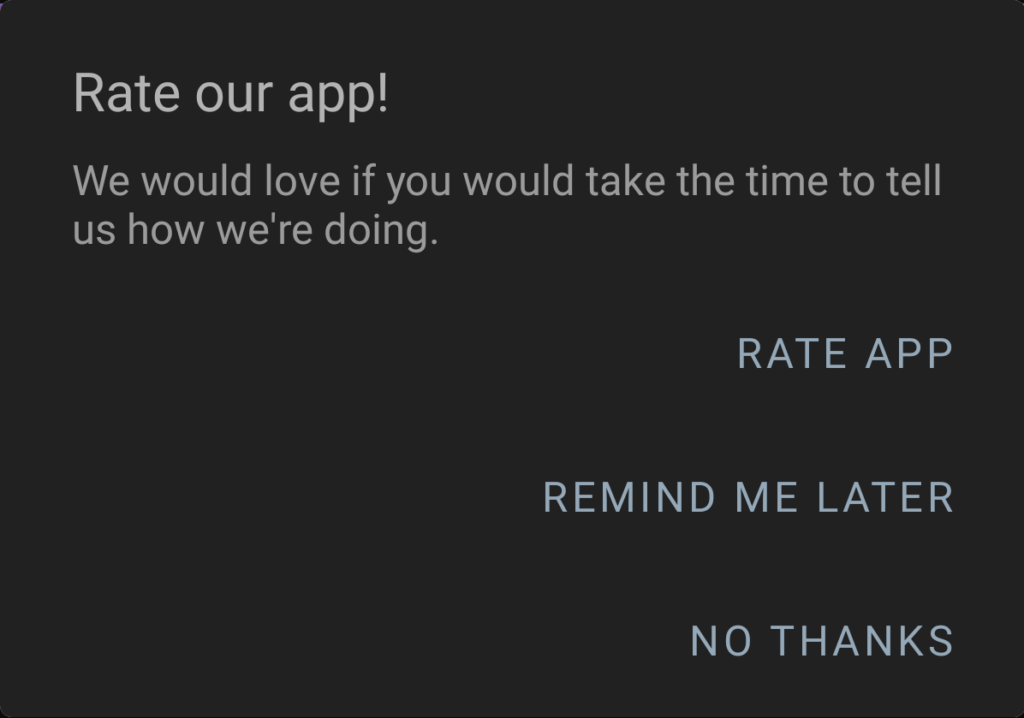 Alchemer Mobile's dark themed Rating Dialog with title, message, and three buttons.
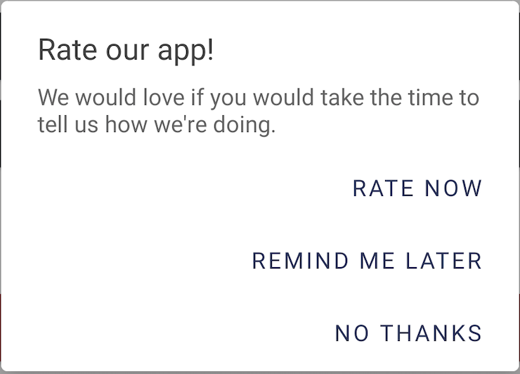 Alchemer Mobile's default light-themed Rating Dialog with title, message, and three buttons.
 Alchemer Mobile default light-theme toolbar, title, and introduction
 Alchemer Mobile default dark-theme toolbar, title, and introduction
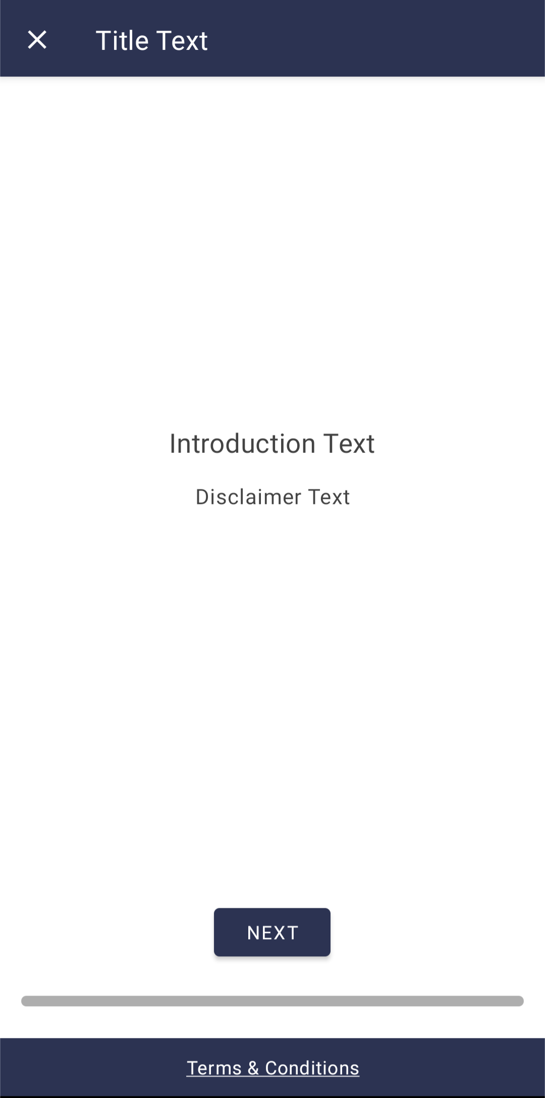 Alchemer Mobile's default survey introduction screen
 Alchemer Mobile's default survey success screen
 Alchemer Mobile default theme survey question title & label (below the title)
 Alchemer Mobile default theme survey question title, label (below the title), & error text
 Alchemer Mobile default light-theme Single Select question type (with other option)
 Alchemer Mobile default light-theme Single Select question type (with other option) error
 Alchemer Mobile default dark-theme Single Select question type (with other option)
 Alchemer Mobile's default dark-theme Single Select question time (with other option) error
 Alchemer Mobile's default theme Multi-Select question type (with other option)
 Alchemer Mobile's default theme Multi-Select question type (with other option) error
 Alchemer Mobile's default dark-theme Multi-Select question type (with other option) error
 Alchemer Mobile default light-theme Free Form question (single-line style)
  Alchemer Mobile default light-theme Free Form question (single-line style) error
 Alchemer Mobile default light-theme Free Form question (multi-line style)
 Alchemer Mobile default light-theme Free Form question (multi-line style) error
 Alchemer Mobile default dark-theme Free Form question (single-line style)
 Alchemer Mobile default dark-theme Free Form question (multi-line style
 Alchemer Mobile default light-theme Range question
 Alchemer Mobile default light-theme Range question error

 Alchemer Mobile default dark-theme Range question
 Alchemer Mobile default dark-theme Range question
  Alchemer Mobile default dark-theme Range question error
 Alchemer Mobile default light theme submit button and bottom bar
 Alchemer Mobile default light-theme submit button and bottom bar error
 Alchemer Mobile default dark-theme submit button and bottom bar error
 Alchemer Mobile's default linear progress bar
 Alchemer Mobile's default segmented progress bar
 Alchemer Mobile default light-theme close survey dialog
 Alchemer Mobile default dark-theme close survey dialog


 Alchemer Mobile default light-theme messages (inbound and outbound)
 Alchemer Mobile default dark-theme messages (inbound and outbound)


 Alchemer Mobile default light-theme image preview screen
